Plots the difference between two years from a contour plot created by plotContours
Source:R/plotDiffContours.R
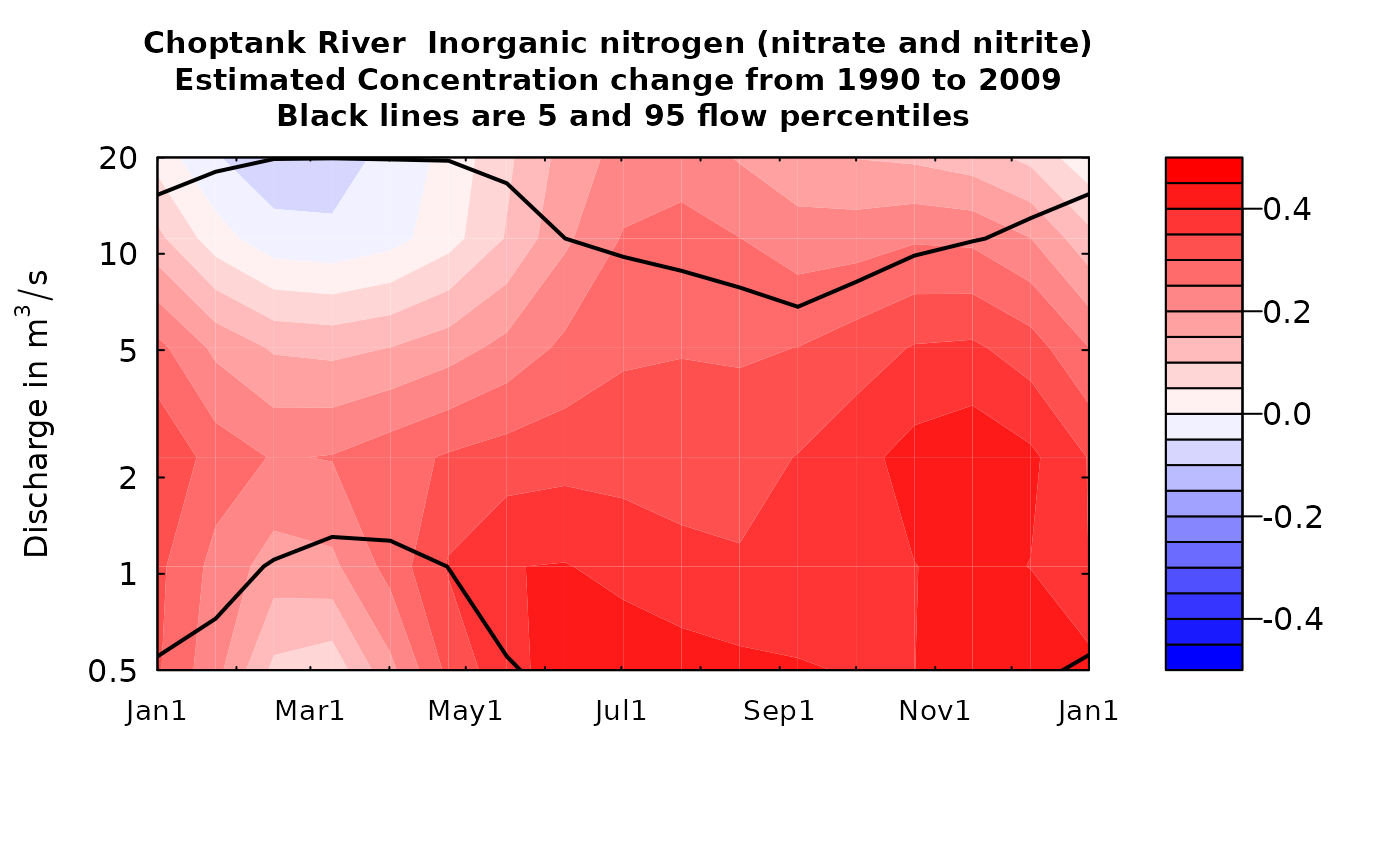
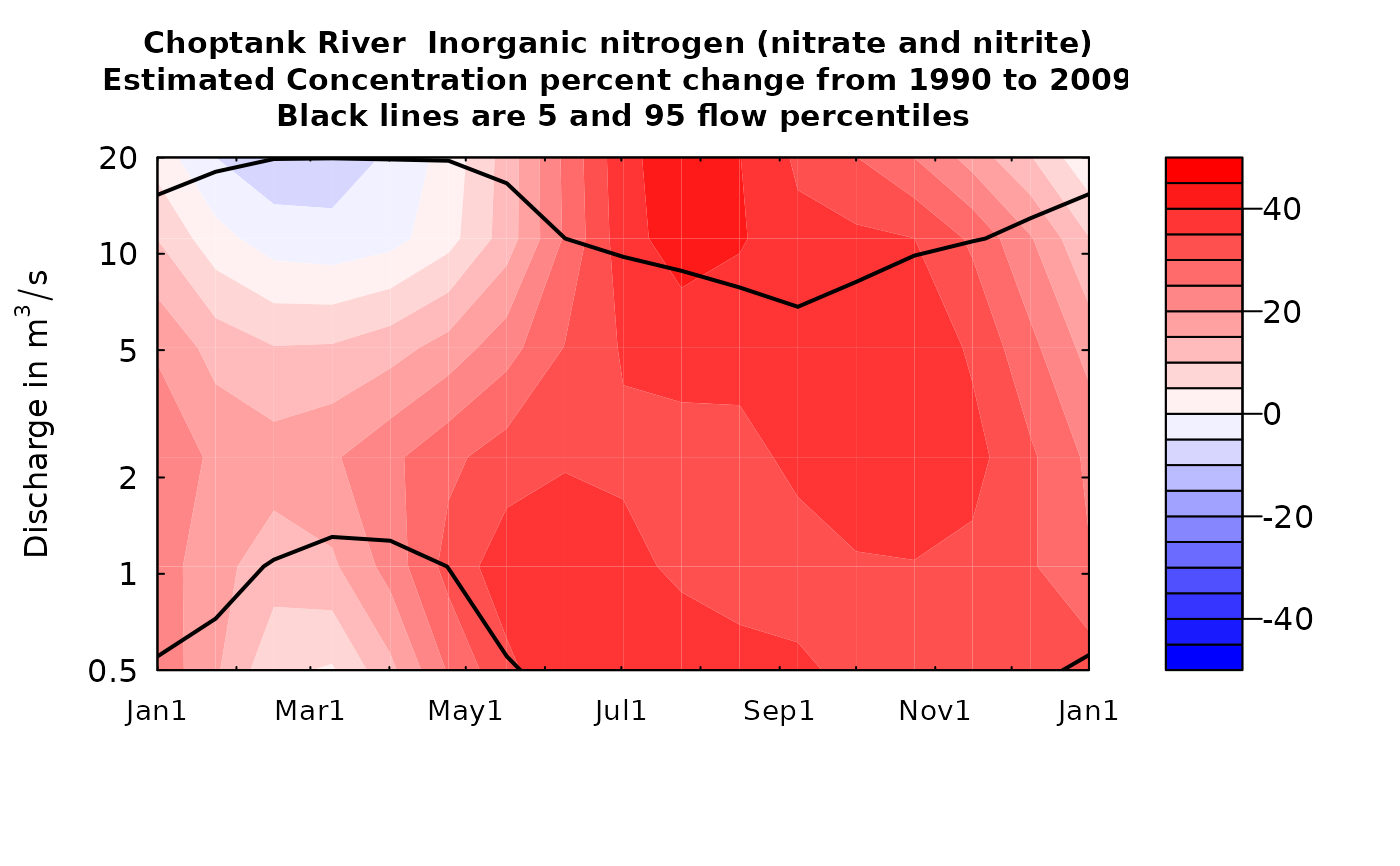
plotDiffContours.RdThese plots are normally used for plotting changes in the estimated concentration surface (whatSurface=3) but can be used to explore the changes in estimated surfaces for the log of concentration or for the standard error (in log space) which is what determines the bias correction.
The difference can be shown either as an arithmetic difference or as a percentage difference.
Although there are a lot of optional arguments to this function, most are set to a logical default.
Data come from named list, which contains a Sample dataframe with the sample data, a Daily dataframe with the daily flow data, and an INFO dataframe with metadata.
Usage
plotDiffContours(eList, year0, year1, qBottom = NA, qTop = NA,
  maxDiff = NA, whatSurface = 3, tcl = 0.03, qUnit = 2, span = 60,
  pval = 0.05, printTitle = TRUE, plotPercent = FALSE, vert1 = NA,
  vert2 = NA, horiz = NA, flowDuration = TRUE, yTicks = NA,
  tick.lwd = 1, lwd = 2, cex.main = 0.95, cex.axis = 1,
  customPar = FALSE, usgsStyle = FALSE,
  color.palette = grDevices::colorRampPalette(c("blue", "white", "red")),
  concLab = 1, monthLab = 1, ...)
Arguments
- eList
named list with at least the Daily and INFO dataframes, and surfaces matrix
- year0
numeric value for the calendar year that is the first year of the pair of years for the analysis, should be a whole number
- year1
numeric value for the calendar year that is the second year of the pair of years for the analysis, should be a whole number
- qBottom
numeric value for the bottom edge of the graph, expressed in the units of discharge that are being used (as specified in qUnit). NA will choose a "pretty" lower limit nearest to the 5% of discharge. If yTicks are specified, then the first value of yTicks becomes the lowest discharge shown on the figure.
- qTop
numeric value for the top edge of the graph, expressed in the units of discharge that are being used (as specified in qUnit). NA will choose a "pretty" upper limit nearest to the 95% of discharge. If yTicks are specified, then the last value of yTicks becomes the highest discharge shown on the figure.
- maxDiff
numeric value which is the absolute value of the largest change in concentration that will be shown on the figure. If NA, the scale will be set from 5% to 95% of the concentration difference. If plotPercent = TRUE then maxDiff will be the maximum percentage difference.
- whatSurface
numeric value, can only accept 1, 2, or 3; whatSurface = 1 is yHat (log concentration), whatSurface = 2 is SE (standard error of log concentration), and whatSurface = 3 is ConcHat (unbiased estimate of concentration), default = 3
- tcl
numeric, length of tick marks in inches, default is 0.1
- qUnit
object of qUnit class.
printqUnitCheatSheet, or numeric represented the short code, or character representing the descriptive name.- span
numeric, it is the half-width (in days) of the smoothing window for computing the flow duration information, default = 60
- pval
numeric, the probability value for the lower flow frequency line on the graph
- printTitle
logical variable if TRUE title is printed, if FALSE not printed
- plotPercent
logical. If TRUE, plots percent difference, if FALSE, plots arithmetic differences. Defaults to FALSE.
- vert1
numeric, the location in time for a black vertical line on the figure, yearStart < vert1 < yearEnd, default is NA (vertical line is not drawn)
- vert2
numeric, the location in time for a black vertical line on the figure, yearStart < vert2 < yearEnd, default is NA (vertical line is not drawn)
- horiz
numeric, the location in discharge for a black horizontal line on the figure, qBottom<vert1<qTop, default is NA (no horizontal line is drawn)
- flowDuration
logical variable if TRUE plot the flow duration lines (5 and 95 flow percentiles), if FALSE do not plot them, default = TRUE
- yTicks
vector of yTick labels and marks that will be plotted in log space. (for example yTicks = c(3, 5, 10, 20, 50, 100, 200, 400). The first and last values determine the range of the y axis. If NA, the tick marks will be automatically generated.
- tick.lwd
line width for axis ticks, default is 2
- lwd
numeric, line width of flowDuration curve, default is 1
- cex.main
magnification to be used for main titles relative to the current setting of cex
- cex.axis
magnification to be used for axis annotation relative to the current setting of cex
- customPar
logical defaults to FALSE. If TRUE, par() should be set by user before calling this function (for example, adjusting margins with par(mar=c(5,5,5,5))). If customPar FALSE, EGRET chooses the best margins.
- usgsStyle
logical option to use USGS style guidelines. Setting this option to TRUE does NOT guarantee USGS compliance. It will only change automatically generated labels.
- color.palette
a function that creates a color palette for the contour plot. Default goes from blue to white to red using the function
grDevices::colorRampPalette(c("blue","white","red")). A few preset options are heat.colors, topo.colors, and terrain.colors.- concLab
object of concUnit class, or numeric represented the short code, or character representing the descriptive name. By default, this argument sets concentration labels to use either Concentration or Conc (for tiny plots). Units are taken from the eList$INFO$param.units. To use any other words than "Concentration" see
vignette(topic = "units", package = "EGRET").- monthLab
object of monthLabel class, or numeric represented the short code, or character representing the descriptive name.
- ...
arbitrary functions sent to the generic plotting function. See ?par for details on possible parameters