Calculating Moving Averages and Historical Flow Quantiles
Laura DeCicco
2016-10-25
Source:vignettes/movingAverages.Rmd
movingAverages.RmdWARNING
This post is very old! A better way to do all these plots and calculations can be found here: https://doi-usgs.github.io/HASP/
WARNING
This post will show simple way to calculate moving averages, calculate historical-flow quantiles, and plot that information. The goal is to reproduce the graph at this link: PA Graph. The motivation for this post was inspired by a USGS colleague that that is considering creating these type of plots in R. We thought this plot provided an especially fun challenge - maybe you will, too!
First we get the data using the dataRetrieval package. The siteNumber and parameterCd could be adjusted for other sites or measured parameters. In this example, we are getting discharge (parameter code 00060) at a site in PA.
It may be important to note that this script is a bit lazy in handling leap days.
Get data using dataRetrieval
library(dataRetrieval)

# Retrieve daily Q
siteNumber <- c("01538000")
parameterCd <- "00060" # Discharge
dailyQ <- readNWISdv(siteNumber, parameterCd)
## Warning in readNWISdv(siteNumber, parameterCd): NWIS servers are slated for
## decommission. Please begin to migrate to read_waterdata_daily.
dailyQ <- renameNWISColumns(dailyQ)
stationInfo <- readNWISsite(siteNumber)
## Warning in readNWISsite(siteNumber): NWIS servers are slated for decommission.
## Please begin to migrate to read_waterdata_monitoring_location
nrow(dailyQ)## [1] 38898Calculate moving average
Next, we calculate a 30-day moving average on all of the flow data:
library(dplyr)
library(zoo)

# Check for missing days, if so, add NA rows:
if (as.numeric(diff(range(dailyQ$Date))) != (nrow(dailyQ) + 1)) {
  fullDates <- seq(
    from = min(dailyQ$Date),
    to = max(dailyQ$Date), by = "1 day"
  )
  fullDates <- data.frame(
    Date = fullDates,
    agency_cd = unique(dailyQ$agency_cd),
    site_no = unique(dailyQ$site_no)
  )
  dailyQ <- fullDates %>%
    left_join(dailyQ,
      by = c("Date", "agency_cd", "site_no")
    ) %>%
    arrange(Date)
}

dailyQ <- dailyQ %>%
  mutate(
    rollMean = rollmean(Flow, 30, fill = NA, align = "center"),
    day.of.year = as.numeric(strftime(Date,
      format = "%j"
    ))
  )
Calculate historical percentiles
We can use the quantile function to calculate historical
percentile flows. Then use the loess function for
smoothing. The argument smooth.span defines how much
smoothing should be applied. To get a smooth transistion at the start of
the graph, we can add include an earlier year which is not plotted at
the end.
summaryQ <- dailyQ %>%
  group_by(day.of.year) %>%
  summarize(
    p75 = quantile(rollMean, probs = .75, na.rm = TRUE),
    p25 = quantile(rollMean, probs = .25, na.rm = TRUE),
    p10 = quantile(rollMean, probs = 0.1, na.rm = TRUE),
    p05 = quantile(rollMean, probs = 0.05, na.rm = TRUE),
    p00 = quantile(rollMean, probs = 0, na.rm = TRUE)
  )

current.year <- as.numeric(strftime(Sys.Date(), format = "%Y"))

summary.0 <- summaryQ %>%
  mutate(
    Date = as.Date(day.of.year - 1,
      origin = paste0(current.year - 2, "-01-01")
    ),
    day.of.year = day.of.year - 365
  )
summary.1 <- summaryQ %>%
  mutate(Date = as.Date(day.of.year - 1,
    origin = paste0(current.year - 1, "-01-01")
  ))
summary.2 <- summaryQ %>%
  mutate(
    Date = as.Date(day.of.year - 1,
      origin = paste0(current.year, "-01-01")
    ),
    day.of.year = day.of.year + 365
  )

summaryQ <- bind_rows(summary.0, summary.1, summary.2)


smooth.span <- 0.3

summaryQ$sm.75 <- predict(loess(p75 ~ day.of.year, data = summaryQ, span = smooth.span))
summaryQ$sm.25 <- predict(loess(p25 ~ day.of.year, data = summaryQ, span = smooth.span))
summaryQ$sm.10 <- predict(loess(p10 ~ day.of.year, data = summaryQ, span = smooth.span))
summaryQ$sm.05 <- predict(loess(p05 ~ day.of.year, data = summaryQ, span = smooth.span))
summaryQ$sm.00 <- predict(loess(p00 ~ day.of.year, data = summaryQ, span = smooth.span))

latest.years <- dailyQ %>%
  filter(Date >= as.Date(paste0(current.year - 1, "-01-01"))) %>%
  mutate(day.of.year = seq_len(nrow(.)))

# Let's just take the middle chunk:
summaryQ <- summaryQ %>%
  filter(day.of.year %in% 1:365)

summaryQ <- summaryQ %>%
  bind_rows(
    summaryQ,
    summaryQ
  ) %>%
  mutate(day.of.year = seq_len(nrow(.)) - 365)
Plot using base R
Many of the graphical requirements defined by the USGS are difficult
to achieve in ggplot2. Base R plotting can be used to
obtain these types of graphs:
title.text <- paste0(
  stationInfo$station_nm, "\n",
  "Provisional Data - Subject to change\n",
  "Record Start = ", min(dailyQ$Date),
  "  Number of years = ",
  as.integer(as.numeric(difftime(
    time1 = max(dailyQ$Date),
    time2 = min(dailyQ$Date),
    units = "weeks"
  )) / 52.25),
  "\nDate of plot = ", Sys.Date(),
  "  Drainage Area = ", stationInfo$drain_area_va, "mi^2"
)

mid.month.days <- c(15, 45, 74, 105, 135, 166, 196, 227, 258, 288, 319, 349)
month.letters <- c("J", "F", "M", "A", "M", "J", "J", "A", "S", "O", "N", "D")
start.month.days <- c(1, 32, 61, 92, 121, 152, 182, 214, 245, 274, 305, 335)
label.text <- c("Normal", "Drought Watch", "Drought Warning", "Drought Emergency")

plot(latest.years$day.of.year, latest.years$rollMean,
  ylim = c(1, 1000), xlim = c(1, 733),
  log = "y", axes = FALSE, type = "n", xaxs = "i", yaxs = "i",
  ylab = "30-day moving ave",
  xlab = ""
)
title(title.text, cex.main = 0.75)
polygon(c(summaryQ$day.of.year, rev(summaryQ$day.of.year)),
  c(summaryQ$sm.75, rev(summaryQ$sm.25)),
  col = "darkgreen", border = FALSE
)
polygon(c(summaryQ$day.of.year, rev(summaryQ$day.of.year)),
  c(summaryQ$sm.25, rev(summaryQ$sm.10)),
  col = "yellow", border = FALSE
)
polygon(c(summaryQ$day.of.year, rev(summaryQ$day.of.year)),
  c(summaryQ$sm.10, rev(summaryQ$sm.05)),
  col = "orange", border = FALSE
)
polygon(c(summaryQ$day.of.year, rev(summaryQ$day.of.year)),
  c(summaryQ$sm.05, rev(summaryQ$sm.00)),
  col = "red", border = FALSE
)
lines(latest.years$day.of.year, latest.years$rollMean,
  lwd = 2, col = "black"
)
abline(v = 366)
axis(2, las = 1, at = c(1, 100, 1000), tck = -0.02)
axis(2, at = c(seq(1, 90, by = 10)), labels = NA, tck = -0.01)
axis(2, at = c(seq(100, 1000, by = 100)), labels = NA, tck = -0.01)
axis(1,
  at = c(mid.month.days, 365 + mid.month.days),
  labels = rep(month.letters, 2),
  tick = FALSE, line = -0.5, cex.axis = 0.75
)
axis(1,
  at = c(start.month.days, 365 + start.month.days),
  labels = NA, tck = -0.02
)
axis(1,
  at = c(182, 547), labels = c(current.year - 1, current.year),
  line = .5, tick = FALSE
)
legend("bottom", label.text,
  horiz = TRUE,
  fill = c("darkgreen", "yellow", "orange", "red"),
  inset = c(0, 0), xpd = TRUE, bty = "n", cex = 0.75
)
box()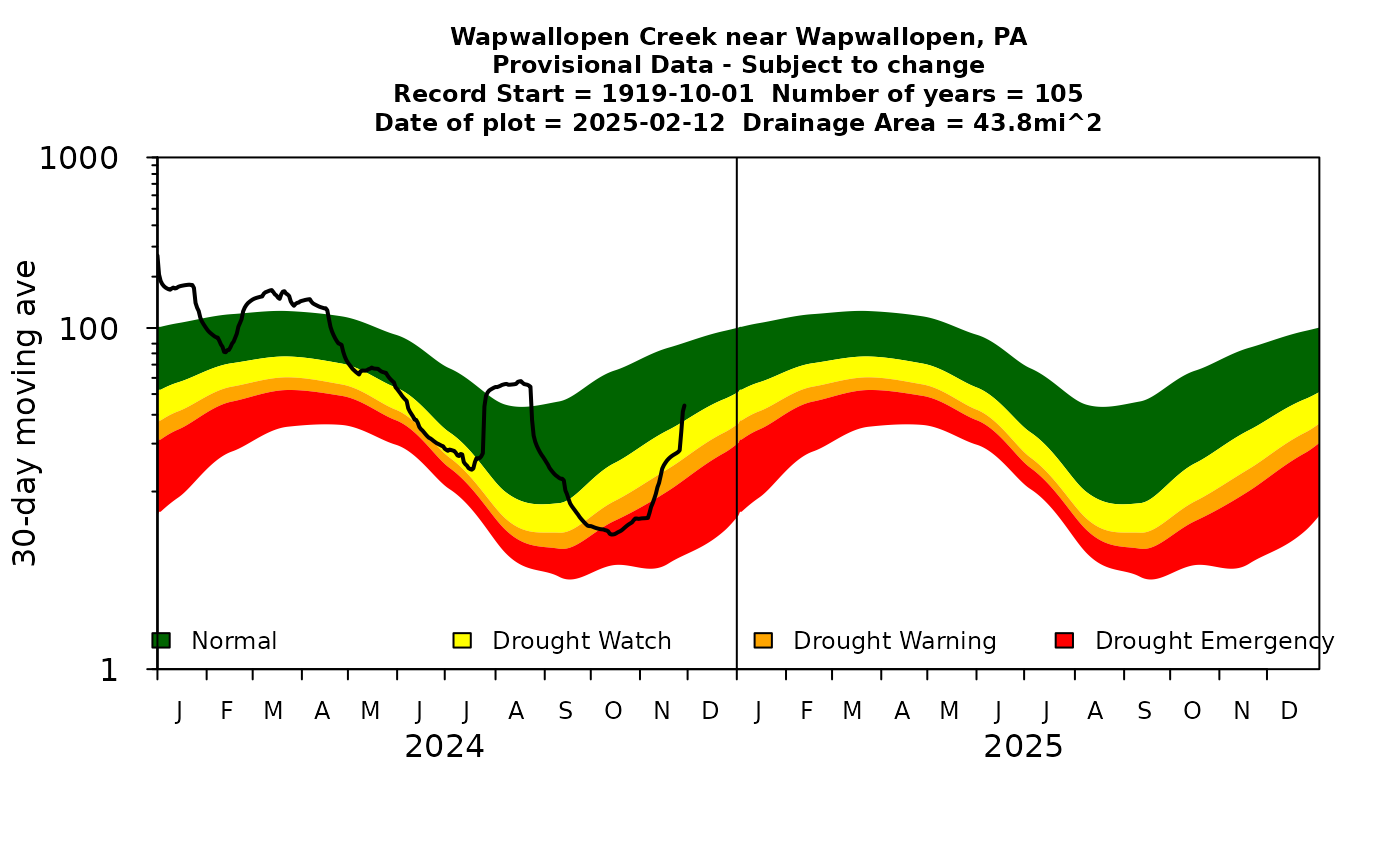
Simple 30-day moving average daily flow plot using base R
Plot using ggplot2
Finally, we can also try to create the graph using the
ggplot2 package. The following script shows a simple way to
re-create the graph in ggplot2 with no effort on imitating
desired style:
library(ggplot2)

simple.plot <- ggplot(data = summaryQ, aes(x = day.of.year)) +
  geom_ribbon(aes(ymin = sm.25, ymax = sm.75, fill = "Normal")) +
  geom_ribbon(aes(ymin = sm.10, ymax = sm.25, fill = "Drought Watch")) +
  geom_ribbon(aes(ymin = sm.05, ymax = sm.10, fill = "Drought Warning")) +
  geom_ribbon(aes(ymin = sm.00, ymax = sm.05, fill = "Drought Emergency")) +
  scale_y_log10(limits = c(1, 1000)) +
  geom_line(data = latest.years, aes(x = day.of.year, y = rollMean, color = "30-Day Mean"), size = 2) +
  geom_vline(xintercept = 365)

simple.plot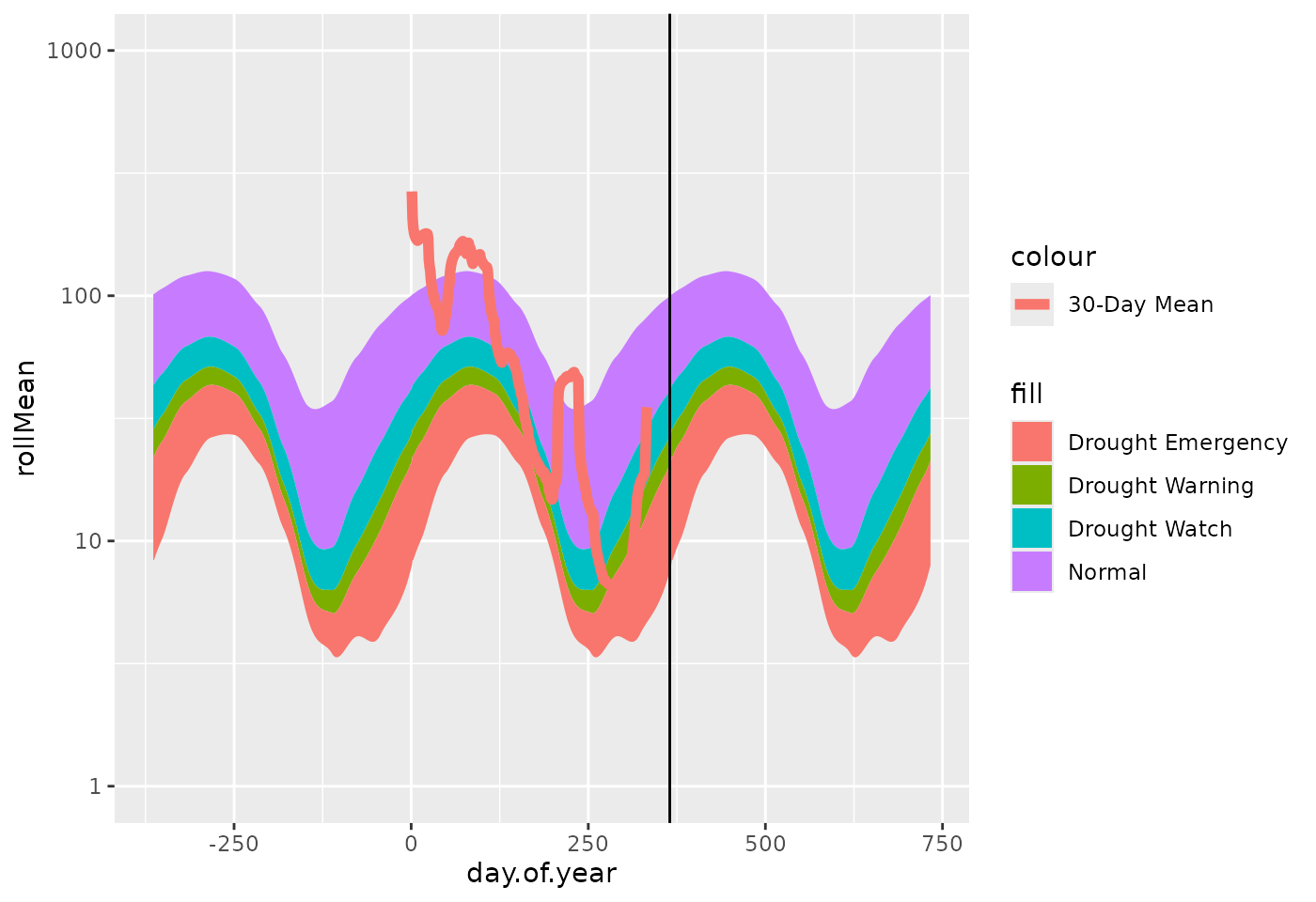
Simple 30-day moving average daily flow plot using ggplot2
Next, we can play with various options to do a better job to imitate the style:
styled.plot <- simple.plot +
  scale_x_continuous(
    breaks = c(mid.month.days, 365 + mid.month.days),
    labels = rep(month.letters, 2),
    expand = c(0, 0),
    limits = c(0, 730)
  ) +
  annotation_logticks(sides = "l") +
  expand_limits(x = 0) +
  annotate(
    geom = "text",
    x = c(182, 547),
    y = 1,
    label = c(current.year - 1, current.year), size = 4
  ) +
  theme_bw() +
  theme(
    axis.ticks.x = element_blank(),
    panel.grid.major = element_blank(),
    panel.grid.minor = element_blank()
  ) +
  labs(title = title.text,
    y = "30-day moving ave", x = ""
  ) +
  scale_fill_manual(
    name = "", breaks = label.text,
    values = c("red", "orange", "yellow", "darkgreen")
  ) +
  scale_color_manual(name = "", values = "black") +
  theme(legend.position = "bottom")

styled.plot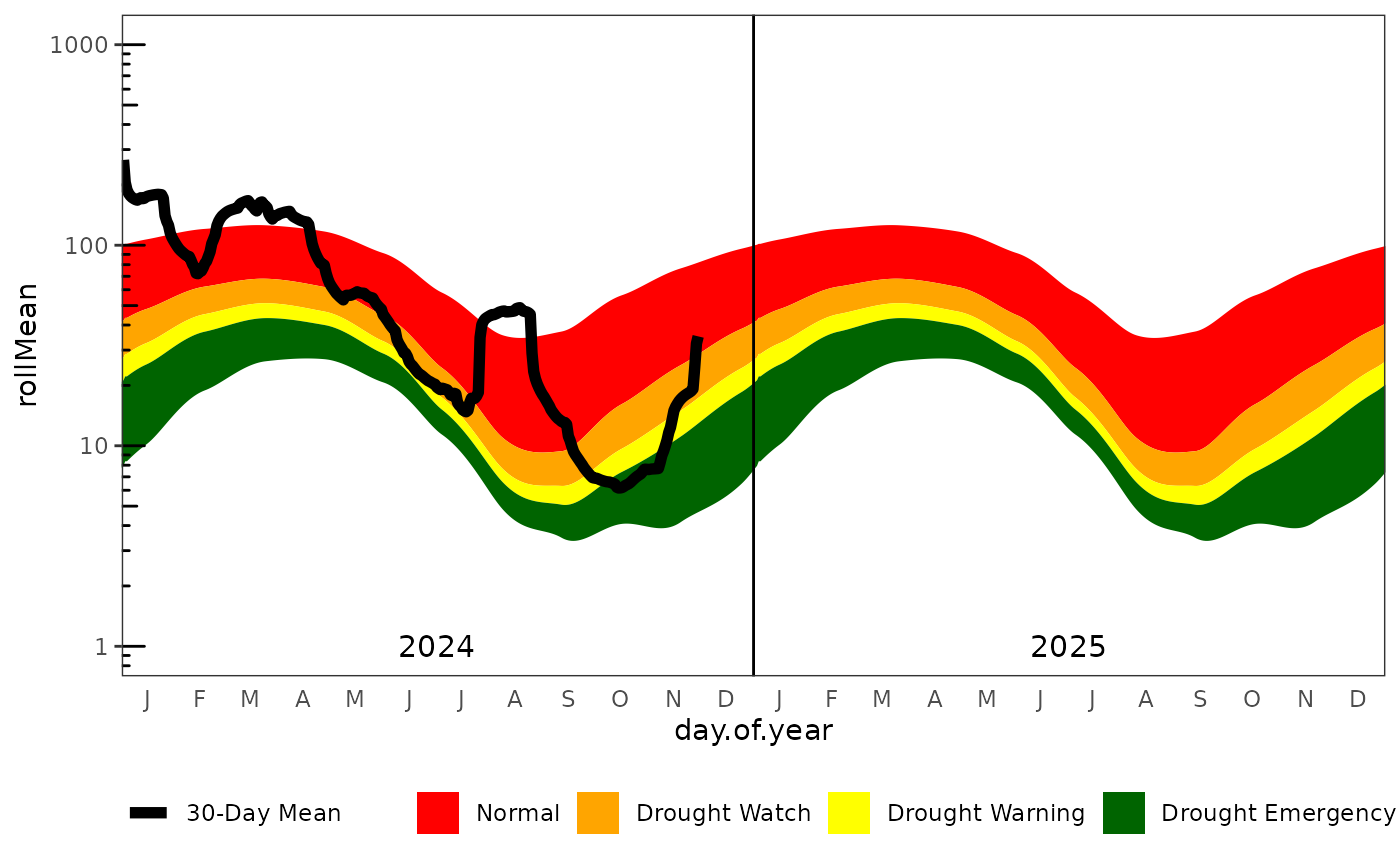
Detailed 30-day moving average daily flow plot