Using the dataRetrieval Stats Service
David Watkins
2016-10-05
Source:vignettes/statsServiceMap.Rmd
statsServiceMap.RmdIntroduction
This script utilizes the new dataRetrieval package
access to the USGS Statistics
Web Service. We will be pulling daily mean data using the daily
value service in readNWISdata, and using the stats service
data to put it in the context of the site’s history. Here we are
retrieving data for July 12th in the Upper Midwest, where a major storm
system had recently passed through. You can modify this script to look
at other areas and dates simply by modifying the states and
storm.date objects.
To run this code, we recommend having either
dataRetreival version 2.5.13 (currently the latest release
on CRAN) or version 2.6.1 (currently the latest Github release).
Get the data
There are two separate dataRetrieval calls here — one to
retrieve the daily discharge data, and one to retrieve the historical
discharge statistics. Both calls are inside loops to split them into
smaller pieces, to accomodate web service restrictions. The daily values
service allows only single states as a filter, so we loop over the list
of states. The stats service does not allow requests of more than ten
sites, so the loop iterates by groups of ten site codes. Retrieving the
data can take a few tens of seconds. Once we have both the daily value
and statistics data, the two data frames are joined by site number via
dplyr’s
left_join function. We use a pipe
to send the output of the join to na.omit() function. Then
we add a column to the final data frame to hold the color value for each
station.
# example stats service map, comparing real-time current discharge to history for each site
# reusable for other state(s)
# David Watkins June 2016


library(maps)
library(dplyr)
library(lubridate)
library(dataRetrieval)

# pick state(s) and date
states <- c("WI", "MN", "ND", "SD", "IA")
storm.date <- "2016-07-12"

# download each state individually
for (st in states) {
  stDV <- renameNWISColumns(readNWISdata(
    service = "dv",
    parameterCd = "00060",
    stateCd = st,
    startDate = storm.date,
    endDate = storm.date
  ))
  if (st != states[1]) {
    storm.data <- full_join(storm.data, stDV)
    sites <- full_join(sites, attr(stDV, "siteInfo"))
  } else {
    storm.data <- stDV
    sites <- attr(stDV, "siteInfo")
  }
}

# retrieve stats data, dealing with 10 site limit to stat service requests
reqBks <- seq(1, nrow(sites), by = 10)
statData <- data.frame()
for (i in reqBks) {
  getSites <- sites$site_no[i:(i + 9)]
  currentSites <- readNWISstat(
    siteNumbers = getSites,
    parameterCd = "00060",
    statReportType = "daily",
    statType = c("p10", "p25", "p50", "p75", "p90", "mean")
  )
  statData <- rbind(statData, currentSites)
}

statData.storm <- statData[statData$month_nu == month(storm.date) &
  statData$day_nu == day(storm.date), ]

finalJoin <- left_join(storm.data, statData.storm)
finalJoin <- left_join(finalJoin, sites)

finalJoin[, grep("_va", names(finalJoin))] <- sapply(
  finalJoin[
    ,
    grep("_va", names(finalJoin))
  ],
  function(x) as.numeric(x)
)

# remove sites without current data
finalJoin <- finalJoin[!is.na(finalJoin$Flow), ]


# classify current discharge values
finalJoin$class <- NA

finalJoin$class[finalJoin$Flow > finalJoin$p75_va] <- "navy"
finalJoin$class[finalJoin$Flow < finalJoin$p25_va] <- "red"

finalJoin$class[finalJoin$Flow > finalJoin$p25_va &
  finalJoin$Flow <= finalJoin$p50_va] <- "green"
finalJoin$class[finalJoin$Flow > finalJoin$p50_va &
  finalJoin$Flow <= finalJoin$p75_va] <- "blue"

finalJoin$class[is.na(finalJoin$class) &
  finalJoin$Flow > finalJoin$p50_va] <- "cyan"
finalJoin$class[is.na(finalJoin$class) &
  finalJoin$Flow < finalJoin$p50_va] <- "yellow"

# take a look at the columns that we will plot later:
head(finalJoin[, c("dec_lon_va", "dec_lat_va", "class")])
## dec_lon_va dec_lat_va class
## 1 -92.09389 46.63333 navy
## 2 -91.59528 46.53778 navy
## 3 -90.96324 46.59439 navy
## 4 -90.76028 46.60917 navy
## 5 -90.59000 46.39472 navy
## 6 -90.69630 46.48661 navyMake the static plot
The base map consists of two plots. The first makes the county lines
with a gray background, and the second overlays the heavier state lines.
After that we add the points for each stream gage, colored by the column
we added to finalJoin. In the finishing details,
grconvertXY is a handy function that converts your inputs
from a normalized (0-1) coordinate system to the actual map coordinates,
which allows the legend and scale to stay in the same relative location
on different maps.
# convert states from postal codes to full names
states <- stateCdLookup(states, outputType = "fullName")
## GET: https://api.waterdata.usgs.gov/samples-data/codeservice/states?mimeType=application%2Fjson
par(pty = "s")
map("county", regions = states, fill = TRUE, col = "gray87", lwd = 0.5)
map("state", regions = states, fill = FALSE, lwd = 2, add = TRUE)
points(finalJoin$dec_lon_va,
  finalJoin$dec_lat_va,
  col = finalJoin$class, pch = 19
)
title(paste("Daily discharge value percentile rank\n", storm.date), line = 1)
par(mar = c(5.1, 4.1, 4.1, 6), xpd = TRUE)

legend.colors <- c(
  "cyan", "yellow",
  "red",
  "green", "blue",
  "navy"
)
legend.names <- c(
  "Q > P50*", "Q < P50*",
  "Q < P25",
  "P25 < Q < P50", "P50 < Q < P75",
  "Q > P75"
)

legend("bottomleft",
  inset = c(0.01, .01),
  legend = legend.names,
  pch = 19, cex = 0.75, pt.cex = 1.2,
  col = legend.colors,
  ncol = 2
)
map.scale(
  ratio = FALSE, cex = 0.75,
  grconvertX(.07, "npc"),
  grconvertY(.2, "npc")
)
text("*Other percentiles not available for these sites",
  cex = 0.75,
  x = grconvertX(0.2, "npc"),
  y = grconvertY(-0.08, "npc")
)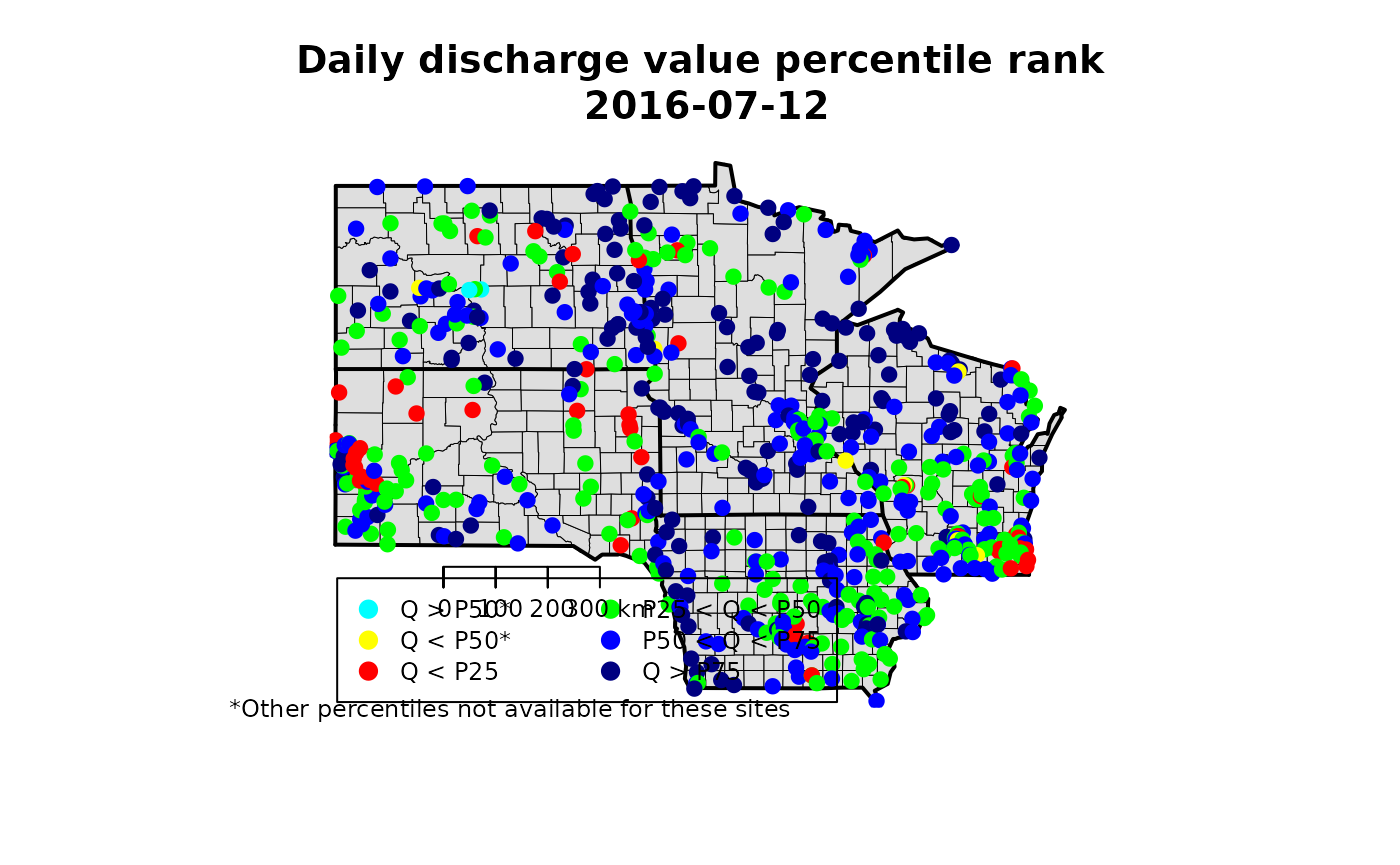
Map discharge percentiles
Make an interactive plot
Static maps are great for papers and presentations. When possible, interactive maps allow the reader more flexibility to examine the data. The R leaflet package makes it easy to create useful interactive maps.
library(leaflet)

finalJoin$popup <- with(finalJoin, paste(
  "<b>", station_nm,
  "</b></br>",
  "Measured Flow:", Flow,
  "ft3/s</br>",
  "25% historical:", p25_va,
  "ft3/s</br>",
  "50% historical:", p50_va,
  "ft3/s</br>",
  "75% historical:", p75_va,
  "ft3/s"
))

leafMapStat <- leaflet(data = finalJoin) %>%
  addProviderTiles("CartoDB.Positron") %>%
  addCircleMarkers(~dec_lon_va, ~dec_lat_va,
    color = ~class, radius = 3, stroke = FALSE,
    fillOpacity = 0.8, opacity = 0.8,
    popup = ~popup
  )

leafMapStat <- addLegend(leafMapStat,
  position = "bottomleft",
  colors = legend.colors,
  labels = legend.names,
  opacity = 0.8
)

leafMapStat