Note
Go to the end to download the full example code.
StatArray Class
Extends the numpy ndarray class to add extra attributes such as names, and units, and allows us to attach statistical descriptors of the array. The direct extension to numpy maintains speed and functionality of numpy arrays.
import numpy as np
import matplotlib.pyplot as plt
import h5py
from geobipy import DataArray, StatArray, Histogram, Distribution, RectilinearMesh1D


# plt.style.use('seaborn-pastel')
Instantiating a new StatArray class
# Integer
test = StatArray(1, name='1')
assert isinstance(test, StatArray) and test.size ==  1 and test.item() == 0.0, TypeError("da 0")
print(test.summary)
test = StatArray(10, name='10')
assert isinstance(test, StatArray) and test.size ==  10 and np.all(test == 0.0), TypeError("da 1")
print(test.summary)
# tuple/Shape
test = StatArray((2, 10), name='(2, 10)')
assert isinstance(test, StatArray) and np.all(test.shape ==  (2, 10)) and np.all(test == 0.0), TypeError("da 2")
print(test.summary)

test = StatArray([2, 10], name='(2, 10)')
assert isinstance(test, StatArray) and np.all(test ==  [2, 10]), TypeError("da 2")
print(test.summary)

# float
test = StatArray(45.454, name='45.454')
assert isinstance(test, StatArray) and test.size ==  1 and test.item() == 45.454, TypeError("da 3")
print(test.summary)
test = StatArray(np.float64(45.454), name='45.454')
assert isinstance(test, StatArray) and test.size ==  1 and test.item() == 45.454, TypeError("da 4")
print(test.summary)

# array
test = StatArray(np.random.randn(1), name="test", units="$\frac{g}{cc}$")
assert isinstance(test, StatArray) and test.size ==  1, TypeError("da 5")
print(test.summary)

test = StatArray(np.arange(10.0), name="test", units="$\frac{g}{cc}$")
assert isinstance(test, StatArray) and test.size ==  10, TypeError("da 6")
print(test.summary)


test = DataArray(np.arange(10.0), name="test", units="$\frac{g}{cc}$")
test = StatArray(test)
assert isinstance(test, StatArray) and test.size ==  10, TypeError("da 6")
print(test.summary)


# The StatArray can take any numpy function that returns an array as an input.
# The name and units of the variable can be assigned to the StatArray.
StatArray
Name:   1
Address:['0x15d8a20d0']
Shape:  (1,)
Values: [0.]
Min:    0.0
Max:    0.0
has_posterior: False

StatArray
Name:   10
Address:['0x15d8a1b50']
Shape:  (10,)
Values: [0. 0. 0. ... 0. 0. 0.]
Min:    0.0
Max:    0.0
has_posterior: False

StatArray
Name:   (2, 10)
Address:['0x15d8a2f50']
Shape:  (2, 10)
Values: [[0. 0. 0. ... 0. 0. 0.]
 [0. 0. 0. ... 0. 0. 0.]]
Min:    0.0
Max:    0.0
has_posterior: False

StatArray
Name:   (2, 10)
Address:['0x15d8a1cd0']
Shape:  (2,)
Values: [ 2 10]
Min:    2
Max:    10
has_posterior: False

StatArray
Name:   45.454
Address:['0x15d8a0a50']
Shape:  (1,)
Values: [45.454]
Min:    45.454
Max:    45.454
has_posterior: False

StatArray
Name:   45.454
Address:['0x15d8a2950']
Shape:  (1,)
Values: [45.454]
Min:    45.454
Max:    45.454
has_posterior: False

StatArray
Name:   test ($\frac{g}{cc}$)
Address:['0x15d8a0fd0']
Shape:  (1,)
Values: [-1.33270353]
Min:    -1.3327035333786468
Max:    -1.3327035333786468
has_posterior: False

StatArray
Name:   test ($\frac{g}{cc}$)
Address:['0x15d8a1e50']
Shape:  (10,)
Values: [0. 1. 2. ... 7. 8. 9.]
Min:    0.0
Max:    9.0
has_posterior: False

StatArray
Name:   test ($\frac{g}{cc}$)
Address:['0x15d8a0fd0']
Shape:  (10,)
Values: [0. 1. 2. ... 7. 8. 9.]
Min:    0.0
Max:    9.0
has_posterior: False
Attaching Prior and Proposal Distributions to a StatArray
The StatArray class has been built so that we may easily attach not only names and units, but statistical distributions too. We won’t go into too much detail about the different distribution
Two types of distributions can be attached to the StatArray.
- Prior Distribution
The prior represents how the user believes the variable should behave from a statistical standpoint. The values of the variable can be evaluated against the attached prior, to determine how likely they are to have occured https://en.wikipedia.org/wiki/Prior_probability
- Proposal Distribution
The proposal describes a probability distribution from which to sample when we wish to perturb the variable https://en.wikipedia.org/wiki/Metropolis%E2%80%93Hastings_algorithm
# Obtain an instantiation of a random number generator.
# This is optional, but is an important consideration for parallel programming.
from numpy.random import Generator
from numpy.random import PCG64DXSM
generator = PCG64DXSM(seed=0)
prng = Generator(generator)

Density = StatArray(10.0, name="test", units="$\frac{g}{cc}$")

Density.prior = Distribution('Uniform', -2.0, 2.0, prng=prng)
We can also attach a proposal distribution
Density.proposal = Distribution('Normal', 0.0, 1.0, prng=prng)
print(Density.summary)
print("Class type of the prior: ",type(Density.prior))
print("Class type of the proposal: ",type(Density.proposal))
StatArray
Name:   test ($\frac{g}{cc}$)
Address:['0x10e4625d0' '0x153f358b0' '0x15d91f6f0' ... '0x15da5d970' '0x15d91f7b0'
 '0x15d91fb70']
Shape:  (1,)
Values: [10.]
Min:    10.0
Max:    10.0
Prior:
|   Uniform Distribution:
|   Min: -2.0
|   Max: 2.0
Proposal:
|   Normal
|       Mean:0.0
|   Variance:1.0
has_posterior: False

Class type of the prior:  <class 'geobipy.src.classes.statistics.UniformDistribution.Uniform'>
Class type of the proposal:  <class 'geobipy.src.classes.statistics.NormalDistribution.Normal'>
The values in the variable can be evaluated against the prior. In this case, we have 3 elements in the variable, and a univariate Normal for the prior. Therefore each element is evaluated to get 3 probabilities, one for each element.
print(Density.probability(log=False))
0.0
The univariate proposal distribution can generate random samples from itself.
print(Density.propose())
1.1375024404290368
From a sampling stand point we can either sample using only the proposal Or we can only generate samples that simultaneously satisfy the prior.
print(Density.propose(relative=True))
[10.53816627]
We can perturb the variable by drawing from the attached proposal distribution.
Density.perturb()
print(Density.summary)
StatArray
Name:   test ($\frac{g}{cc}$)
Address:['0x10e4625d0' '0x153f358b0' '0x15d91f6f0' ... '0x15da5d970' '0x15d91f7b0'
 '0x15d91fb70']
Shape:  (1,)
Values: [0.38188467]
Min:    0.38188466718060166
Max:    0.38188466718060166
Prior:
|   Uniform Distribution:
|   Min: -2.0
|   Max: 2.0
Proposal:
|   Normal
|       Mean:0.0
|   Variance:1.0
has_posterior: False
Attaching a Histogram to capture the posterior distribution
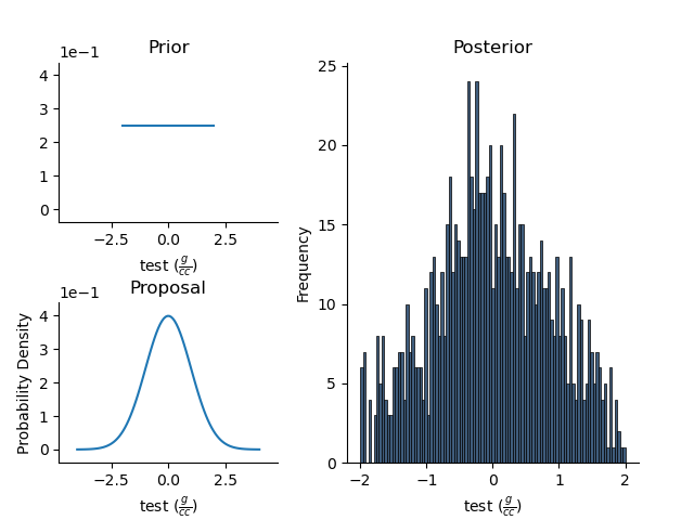
The StatArray can perturb itself, evaluate its current probability given its priors and a histogram can be attached to capture its posterior distribution. As an example, lets create a Histogram class with bins generated from the prior.
bins = Density.prior.bins()
Attach the histogram
Density.posterior = Histogram(mesh = RectilinearMesh1D(edges=bins))
In an iterative sense, we can propose and evaluate new values, and update the posterior
for i in range(1000):
    Density.perturb()
    p = Density.probability(log=False)

    if p > 0.0: # This is a simple example!
        Density.update_posterior()
plt.figure()
Density.summaryPlot()
Attach a multivariate normal distribution as the prior and proposal
Attach the multivariate prior
mean = np.random.randn(Density.size)
variance = np.ones(Density.size)
Density.prior = Distribution('MvNormal', mean, variance, prng=prng)
Since the prior is multivariate, the appropriate equations are used to evaluate the probability for all elements in the StatArray. This produces a single probability.
print(Density.probability(log=False))
0.19092547942875554
Attach the multivariate proposal
mean = np.random.randn(Density.size)
variance = np.ones(Density.size)
Density.proposal = Distribution('MvNormal', mean, variance, prng=prng)
Perturb the variables using the multivariate proposal.
Density.perturb()
Density.summary

with h5py.File('statarray.h5', 'w') as f:
    Density.createHdf(f, 'statarray', withPosterior=True, add_axis=3)
    Density.writeHdf(f, 'statarray', withPosterior=True, index=0)

with h5py.File('statarray.h5', 'r') as f:
    tmp = StatArray.fromHdf(f, 'statarray', index=0, skip_posterior=False)

with h5py.File('statarray.h5', 'r') as f:
    tmp = StatArray.fromHdf(f, 'statarray', skip_posterior=False)
Basic manipulation
The StatArray contains other functions to perform basic array manipulations
These routines essentially wrap around numpy functions, but the result will have the same name and units, and if any prior or proposal are set, those will be carried through too.
1D example
x = StatArray(-np.cumsum(np.arange(10.0)))
print(x)
[ -0. -1. -3. ... -28. -36. -45.]
print(x.insert(i=[0, 9], values=[999.0, 999.0]))
[999. -0. -1. ... -36. 999. -45.]
print(x.prepend(999.0))
[999. -0. -1. ... -28. -36. -45.]
print(x.prepend([998.0, 999.0]))
[998. 999. -0. ... -28. -36. -45.]
print(x.append([998.0, 999.0]))
[ -0. -1. -3. ... -45. 998. 999.]
print(x.resize(14))
[-0. -1. -3. ... -1. -3. -6.]
print(x.delete([5,8]))
[ -0. -1. -3. ... -21. -28. -45.]
print(x.edges())
[ 0.5 -0.5 -2. ... -32. -40.5 -49.5]
print(x.internalEdges())
[ -0.5 -2. -4.5 ... -24.5 -32. -40.5]
print(x.firstNonZero())
1
print(x.lastNonZero())
10
print(x.abs())
[ 0. 1. 3. ... 28. 36. 45.]
2D example
x = StatArray(np.asarray([[0, -2, 3],[3, 0, -1],[1, 2, 0]]))
print(x)
[[ 0 -2  3]
 [ 3  0 -1]
 [ 1  2  0]]
print(x.insert(i=0, values=4))
[[ 4  4  4]
 [ 0 -2  3]
 [ 3  0 -1]
 [ 1  2  0]]
print(x.insert(i=[2, 3], values=5, axis=1))
[[ 0 -2  5  3  5]
 [ 3  0  5 -1  5]
 [ 1  2  5  0  5]]
print(x.insert(i=2, values=[10, 11, 12], axis=1))
[[ 0 -2 10  3]
 [ 3  0 11 -1]
 [ 1  2 12  0]]
print(x.prepend(999))
[[999 999 999]
 [  0  -2   3]
 [  3   0  -1]
 [  1   2   0]]
print(x.prepend([999, 998, 997], axis=1))
[[999 998 997   0  -2   3]
 [999 998 997   3   0  -1]
 [999 998 997   1   2   0]]
print(x.append([[999, 998, 997]]))
[[  0  -2   3]
 [  3   0  -1]
 [  1   2   0]
 [999 998 997]]
print(x.resize([5,5]))
[[ 0 -2  3  3  0]
 [-1  1  2  0  0]
 [-2  3  3  0 -1]
 [ 1  2  0  0 -2]
 [ 3  3  0 -1  1]]
print(x.delete(5))
[ 0 -2 3 ... 1 2 0]
print(x.delete(2, axis=0))
[[ 0 -2  3]
 [ 3  0 -1]]
print(x.firstNonZero(axis=0))
[1 0 0]
print(x.lastNonZero(axis=0))
[3 3 2]
print(x.firstNonZero(axis=1))
[1 0 0]
print(x.lastNonZero(axis=1))
[3 3 2]
print(x.abs())
[[0 2 3]
 [3 0 1]
 [1 2 0]]
Plotting
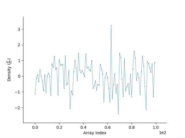
We can easily plot the StatArray with its built in plotting functions. All plotting functions can take matplotlib keywords
# The simplest is to just plot the array

Density = StatArray(np.random.randn(100),name="Density",units="$\frac{g}{cc}$")
Time = StatArray(np.linspace(0, 100, Density.size), name='Time', units='s')
Depth = StatArray(np.random.exponential(size=Density.size), name='Depth', units='m')
plt.figure()
_ = Density.plot(linewidth=0.5, marker='x', markersize=1.0)
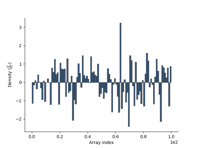
We can quickly plot a bar graph.
plt.figure()
_ = Density.bar()
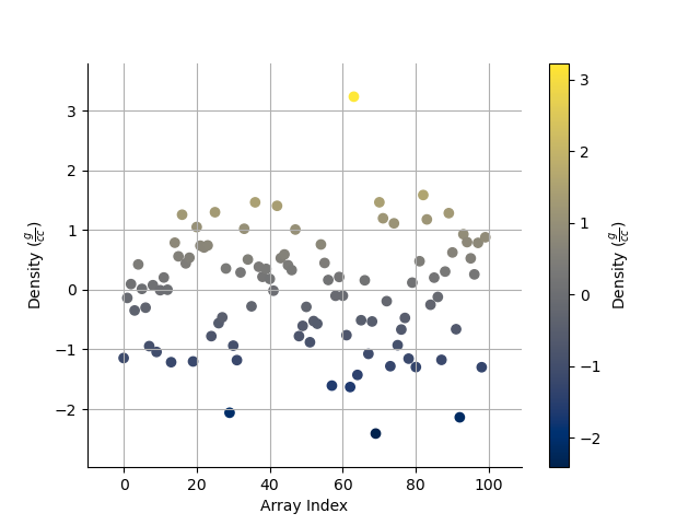
We can scatter the contents of the StatArray if it is 1D
plt.figure()
_ = Density.scatter(alpha=0.7)
Histogram Equalization
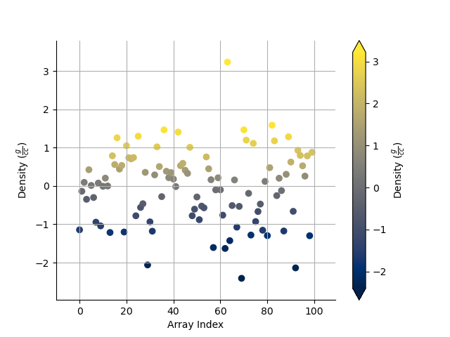
A neat trick with colourmaps is histogram equalization. This approach forces all colours in the images to have an equal weight. This distorts the colour bar, but can really highlight the lower and higher ends of whatever you are plotting. Just add the equalize keyword!
plt.figure()
_ = Density.scatter(alpha=0.7, equalize=True)
Take the log base(x) of the data
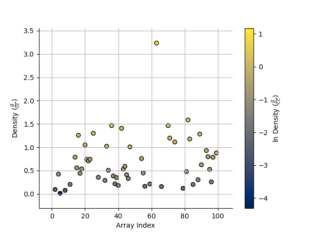
We can also take the data to a log, log10, log2, or a custom number!
plt.figure()
_ = Density.scatter(alpha=0.7,edgecolor='k',log='e') # could also use log='e', log=2, log=x) where x is the base you require
X and Y axes
We can specify the x axis of the scatter plot.
plt.figure()
_ = Density.scatter(x=Time, alpha=0.7, edgecolor='k')
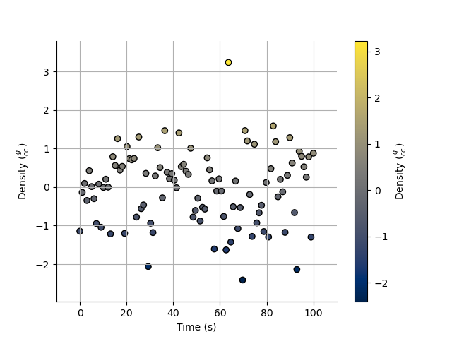
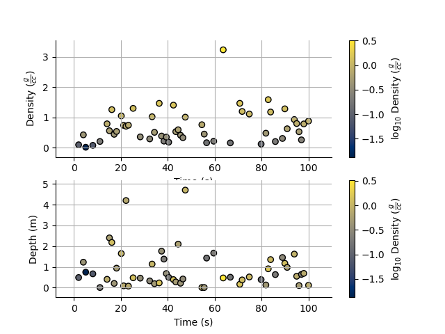
Notice that I never specified the y axis, so the y axis defaulted to the values in the StatArray. In this case, any operations applied to the colours, are also applied to the y axis, e.g. log=10. When I take the values of Density to log base 10, because I do not specify the y plotting locations, those locations are similarly affected.
I can however force the y co-ordinates by specifying it as input. In the second subplot I explicitly plot distance on the y axis. In the first subplot, the y axis is the same as the colourbar.
plt.figure()
ax1 = plt.subplot(211)
Density.scatter(x=Time, alpha=0.7, edgecolor='k', log=10)
plt.subplot(212, sharex=ax1)
_ = Density.scatter(x=Time, y=Depth, alpha=0.7, edgecolor='k', log=10)
Point sizes
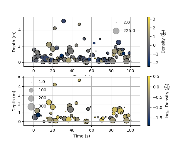
Since the plotting functions take matplotlib keywords, I can also specify the size of each points.
s = np.ceil(100*(np.abs(np.random.randn(Density.size))))
plt.figure()
plt.tight_layout()
ax1 = plt.subplot(211)
Density.scatter(x=Time, y=Depth, s=s, alpha=0.7,edgecolor='k', legend_size=2)
plt.subplot(212, sharex=ax1)
#Density.scatter(x=Time, y=Depth, s=s, alpha=0.7,edgecolor='k', sizeLegend=[1.0, 100, 200, 300])
v = np.abs(Density)+1.0
_ = Density.scatter(x=Time, y=Depth, s=s, alpha=0.7,edgecolor='k', legend_size=[1.0, 100, 200, 300], log=10)
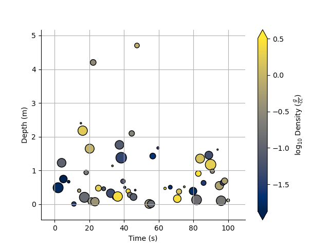
Of course we can still take the log, or equalize the colour histogram
plt.figure()
_ = Density.scatter(x=Time, y=Depth, s=s, alpha=0.7,edgecolor='k',equalize=True,log=10)
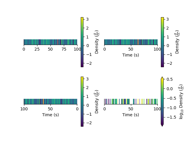
Typically pcolor only works with 2D arrays. The StatArray has a pcolor method that will pcolor a 1D array
plt.figure()
plt.subplot(221)
Density.pcolor()
plt.subplot(222)
Density.pcolor(y=Time)
plt.subplot(223)
Density.pcolor(y=Time, flip=True)
plt.subplot(224)
_ = Density.pcolor(y=Time, log=10, equalize=True)
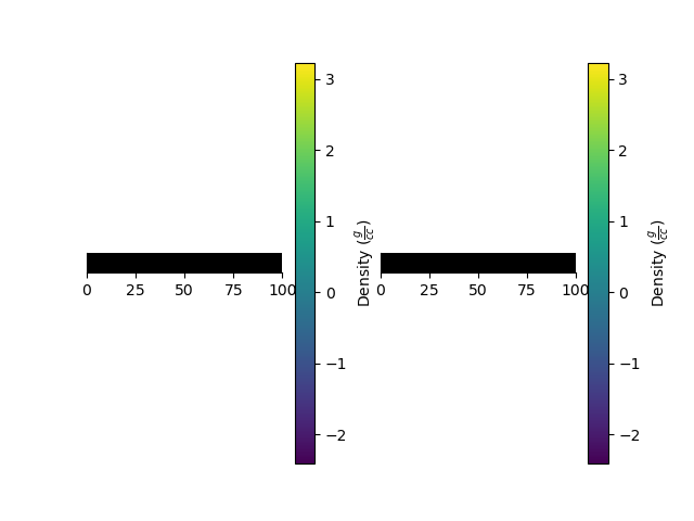
We can add grid lines, and add opacity to each element in the pcolor image
This is useful if the colour values need to be scaled by another variable e.g. variance.
plt.figure()
plt.subplot(121)
Density.pcolor(grid=True, cmap='jet')
plt.subplot(122)
a = np.linspace(1.0, 0.0, Density.size)
_ = Density.pcolor(grid=True, alpha=a, cmap='jet')
We can plot a histogram of the StatArray
plt.figure()
_ = Density.hist(100)
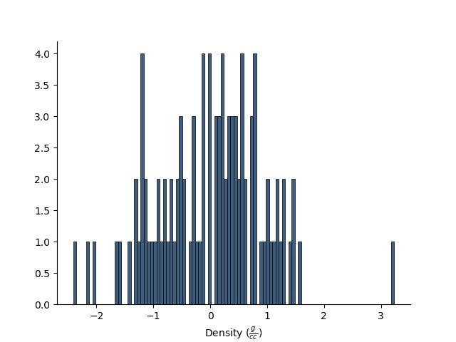
We can write the StatArray to a HDF5 file. HDF5 files are binary files that can include compression. They allow quick and easy access to parts of the file, and can also be written to and read from in parallel!
with h5py.File('1Dtest.h5','w') as f:
    Density.toHdf(f,'test')
We can then read the StatArray from the file Here x is a new variable, that is read in from the hdf5 file we just wrote.
x = StatArray.fromHdf('1Dtest.h5', 'test')
print('x has the same values as Density? ',np.all(x == Density))
x[2] = 5.0 # Change one of the values in x
print('x has its own memory allocated (not a reference/pointer)? ', id(x) != id(Density))
x has the same values as Density?  True
x has its own memory allocated (not a reference/pointer)?  True
We can also define a 2D array
Density = StatArray(np.random.randn(50,100),"Density","$\frac{g}{cc}$")
Density.summary
"StatArray\nName: Density ($\\frac{g}{cc}$)\nAddress:['0x15d94b950']\nShape: (50, 100)\nValues: [[ 0.48957079 -0.67702192 0.62111102 ... 1.01637566 1.20209193\n 0.41799596]\n [ 0.44547561 0.48031438 -2.06904734 ... -0.01646932 0.61426381\n -0.54959319]\n [ 0.00538348 -0.78544357 1.95590857 ... -1.59213919 -0.1411701\n -0.9157846 ]\n ...\n [ 0.23210308 2.3900179 0.04757056 ... -0.26968731 -0.99625759\n 0.01622017]\n [-1.23929122 -0.82852075 0.59921237 ... -0.38958349 0.51283965\n 0.58431603]\n [ 0.48587545 0.68364767 1.74001602 ... -0.83376336 1.41033831\n -0.03525473]]\nMin: -3.657253370532356\nMax: 3.7262870836418522\nhas_posterior: False\n"
The StatArray Class’s functions work whether it is 1D or 2D
We can still do a histogram
plt.figure()
_ = Density.hist()
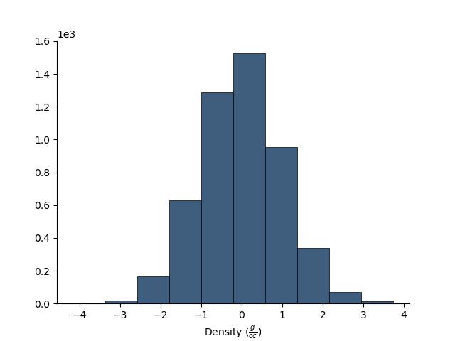
And we can use pcolor to plot the 2D array
plt.figure()
_ = Density.pcolor()
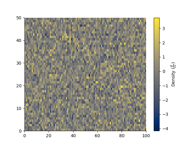
The StatArray comes with extra plotting options
Here we specify the x and y axes for the 2D array using two other 1D StatArrays
plt.figure()
x = StatArray(np.arange(101),name='x Axis',units = 'mm')
y = StatArray(np.arange(51),name='y Axis',units = 'elephants')
_ = Density.pcolor(x=x, y=y)
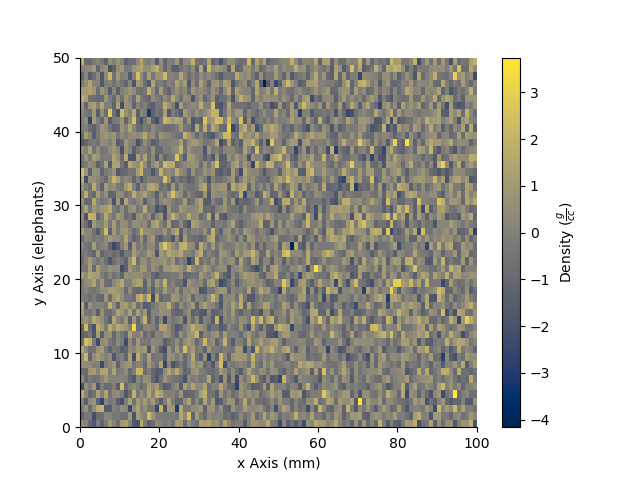
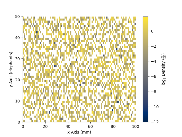
We can plot using a log10 scale, in this case, we have values that are less than or equal to 0.0. Plotting with the log option will by default mask any of those values, and will let you know that it has done so!
plt.figure()
_ = Density.pcolor(x=x,y=y,log=2)
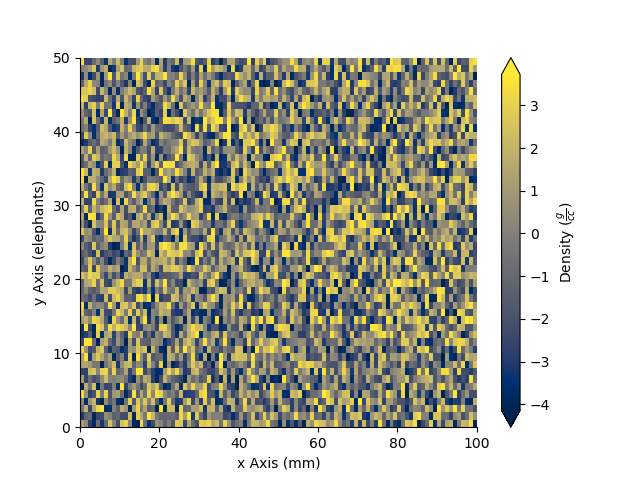
A neat trick with colourmaps is histogram equalization. This approach forces all colours in the image to have an equal amount. This distorts the colours, but can really highlight the lower and higher ends of whatever you are plotting
plt.figure()
_ = Density.pcolor(x=x, y=y, equalize=True)
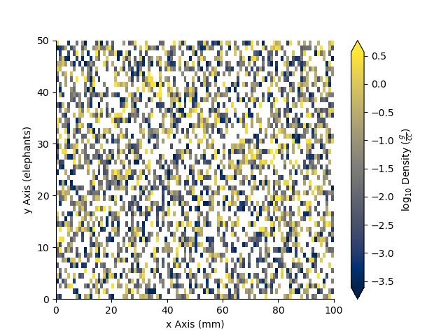
We can equalize the log10 plot too :)
plt.figure()
_ = Density.pcolor(x=x,y=y,equalize=True, log=10)
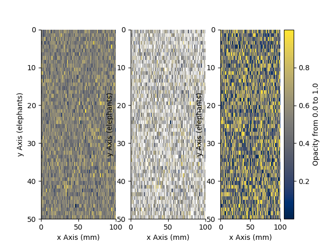
We can add opacity to each pixel in the image
a = StatArray(np.random.random(Density.shape), 'Opacity from 0.0 to 1.0')
plt.figure()
ax1 = plt.subplot(131)
ax = Density.pcolor(x=x, y=y, flipY=True, linewidth=0.1, colorbar=False)
plt.subplot(132, sharex=ax1, sharey=ax1)
ax = Density.pcolor(x=x, y=y, alpha=a, flipY=True, linewidth=0.1, colorbar=False)
plt.subplot(133, sharex=ax1, sharey=ax1)
_ = a.pcolor(x=x, y=y, flipY=True)
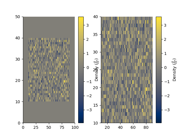
If the array potentially has a lot of white space around the edges, we can trim the image
Density[:10, :] = 0.0
Density[-10:, :] = 0.0
Density[:, :10] = 0.0
Density[:, -10:] = 0.0
plt.figure()
plt.subplot(121)
Density.pcolor()
plt.subplot(122)
_ = Density.pcolor(trim=0.0)
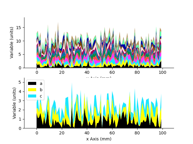
Create a stacked area plot of a 2D StatArray
A = StatArray(np.abs(np.random.randn(13,100)), name='Variable', units="units")
x = StatArray(np.arange(100),name='x Axis',units = 'mm')
plt.figure()
ax1 = plt.subplot(211)
A.stackedAreaPlot(x=x, axis=1)
plt.subplot(212, sharex=ax1)
_ = A.stackedAreaPlot(x=x, i=np.s_[[1,3,4],:], axis=1, labels=['a','b','c'])

plt.show()
Total running time of the script: (0 minutes 2.756 seconds)