Note
Go to the end to download the full example code.
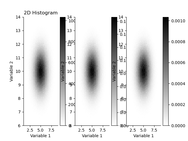
Histogram 2D
This 2D histogram class allows efficient updating of histograms, plotting and saving as HDF5.
import h5py
import geobipy
from geobipy import StatArray
from geobipy import Histogram
import matplotlib.pyplot as plt
import matplotlib.gridspec as gridspec
from geobipy import RectilinearMesh2D
import numpy as np
Create some histogram bins in x and y
x = StatArray(np.linspace(-4.0, 4.0, 100), 'Variable 1')
y = StatArray(np.linspace(-4.0, 4.0, 105), 'Variable 2')

mesh = RectilinearMesh2D(x_edges=x, y_edges=y)
Instantiate
H = Histogram(mesh)
Generate some random numbers
a = np.random.randn(1000000)
b = np.random.randn(1000000)
Update the histogram counts
H.update(a, b)
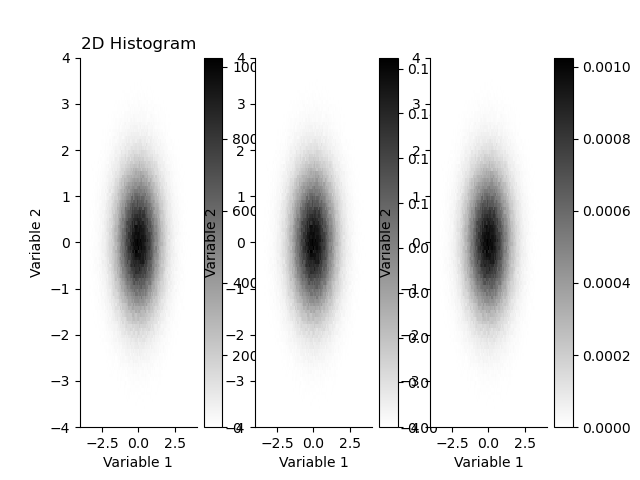
plt.figure()
plt.subplot(131)
plt.title("2D Histogram")
_ = H.plot(cmap='gray_r')
plt.subplot(132)
H.pdf.plot(cmap='gray_r')
plt.subplot(133)
H.pmf.plot(cmap='gray_r')
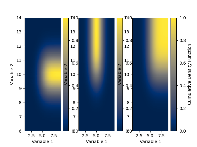
plt.figure()
plt.subplot(131)
H.cdf(axis=0).plot()
plt.subplot(132)
H.cdf(axis=1).plot()
plt.subplot(133)
H.cdf().plot()

(<Axes: xlabel='Variable 1', ylabel='Variable 2'>, <matplotlib.collections.QuadMesh object at 0x153263c50>, <matplotlib.colorbar.Colorbar object at 0x14ef561e0>)
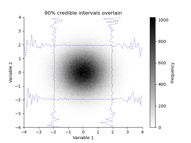
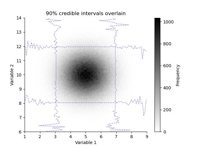
We can overlay the histogram with its credible intervals
plt.figure()
plt.title("90% credible intervals overlain")
H.pcolor(cmap='gray_r')
H.plotCredibleIntervals(axis=0, percent=95.0)
_ = H.plotCredibleIntervals(axis=1, percent=95.0)
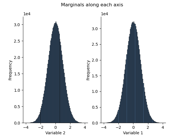
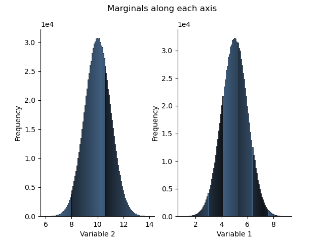
Generate marginal histograms along an axis
h1 = H.marginalize(axis=0)
h2 = H.marginalize(axis=1)
Note that the names of the variables are automatically displayed
plt.figure()
plt.suptitle("Marginals along each axis")
plt.subplot(121)
h1.plot()
plt.subplot(122)
_ = h2.plot()
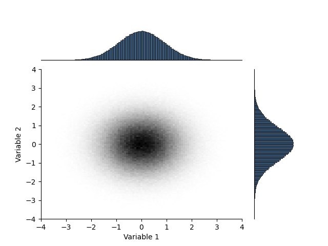
Create a combination plot with marginal histograms. sphinx_gallery_thumbnail_number = 3
plt.figure()
gs = gridspec.GridSpec(5, 5)
gs.update(wspace=0.3, hspace=0.3)
ax = [plt.subplot(gs[1:, :4])]
H.pcolor(colorbar = False)

ax.append(plt.subplot(gs[:1, :4]))
h = H.marginalize(axis=0).plot()
plt.xlabel(''); plt.ylabel('')
plt.xticks([]); plt.yticks([])
ax[-1].spines["left"].set_visible(False)

ax.append(plt.subplot(gs[1:, 4:]))
h = H.marginalize(axis=1).plot(transpose=True)
plt.ylabel(''); plt.xlabel('')
plt.yticks([]); plt.xticks([])
ax[-1].spines["bottom"].set_visible(False)
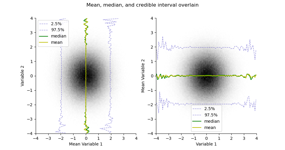
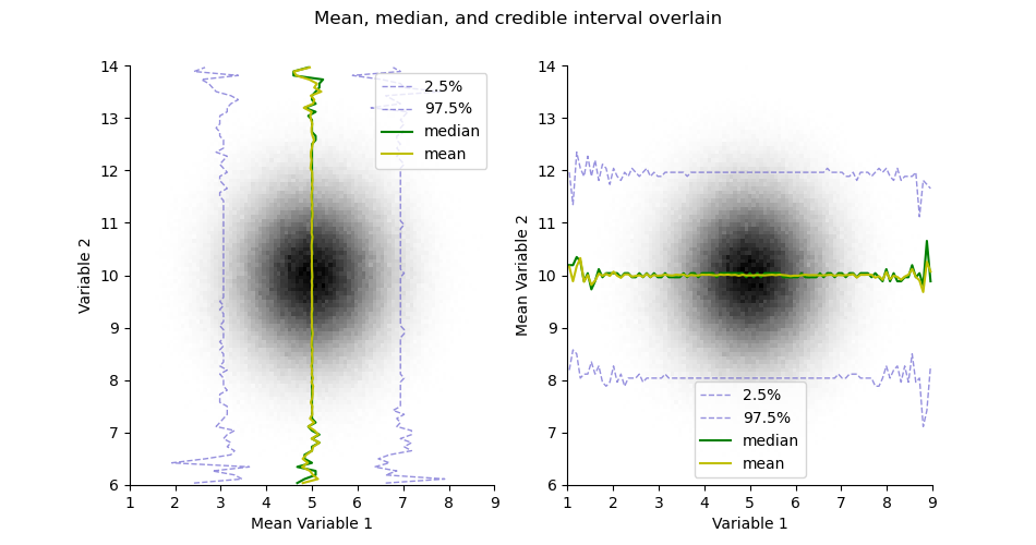
Take the mean or median estimates from the histogram
mean = H.mean()
median = H.median()
plt.figure(figsize=(9.5, 5))
plt.suptitle("Mean, median, and credible interval overlain")
ax = plt.subplot(121)
H.pcolor(cmap='gray_r', colorbar=False)
H.plotCredibleIntervals(axis=0)
H.plotMedian(axis=0, color='g')
H.plotMean(axis=0, color='y')
plt.legend()

plt.subplot(122, sharex=ax, sharey=ax)
H.pcolor(cmap='gray_r', colorbar=False)
H.plotCredibleIntervals(axis=1)
H.plotMedian(axis=1, color='g')
H.plotMean(axis=1, color='y')
plt.legend()
<matplotlib.legend.Legend object at 0x1455ae870>
Get the range between credible intervals
H.credible_range(percent=95.0)
StatArray([3.63636364, 3.23232323, 3.87878788, ..., 3.23232323,
           3.15151515, 4.12121212])
We can map the credible range to an opacity or transparency
H.opacity()
H.transparency()

# H.animate(0, 'test.mp4')

import h5py
with h5py.File('h2d.h5', 'w') as f:
    H.toHdf(f, 'h2d')

with h5py.File('h2d.h5', 'r') as f:
    H1 = Histogram.fromHdf(f['h2d'])

plt.close('all')

x = StatArray(5.0 + np.linspace(-4.0, 4.0, 100), 'Variable 1')
y = StatArray(10.0 + np.linspace(-4.0, 4.0, 105), 'Variable 2')

mesh = RectilinearMesh2D(x_edges=x, x_relative_to=5.0, y_edges=y, y_relative_to=10.0)
Instantiate
H = Histogram(mesh)
Generate some random numbers
a = np.random.randn(1000000) + 5.0
b = np.random.randn(1000000) + 10.0
Update the histogram counts
H.update(a, b)
plt.figure()
plt.subplot(131)
plt.title("2D Histogram")
_ = H.plot(cmap='gray_r')
plt.subplot(132)
H.pdf.plot(cmap='gray_r')
plt.subplot(133)
H.pmf.plot(cmap='gray_r')

plt.figure()
plt.subplot(131)
H.cdf(axis=0).plot()
plt.subplot(132)
H.cdf(axis=1).plot()
plt.subplot(133)
H.cdf().plot()
(<Axes: xlabel='Variable 1', ylabel='Variable 2'>, <matplotlib.collections.QuadMesh object at 0x14557f680>, <matplotlib.colorbar.Colorbar object at 0x15377a690>)
We can overlay the histogram with its credible intervals
plt.figure()
plt.title("90% credible intervals overlain")
H.pcolor(cmap='gray_r')
H.plotCredibleIntervals(axis=0, percent=95.0)
_ = H.plotCredibleIntervals(axis=1, percent=95.0)

# Generate marginal histograms along an axis
h1 = H.marginalize(axis=0)
h2 = H.marginalize(axis=1)
Note that the names of the variables are automatically displayed
plt.figure()
plt.suptitle("Marginals along each axis")
plt.subplot(121)
h1.plot()
plt.subplot(122)
_ = h2.plot()
Create a combination plot with marginal histograms. sphinx_gallery_thumbnail_number = 3
plt.figure()
gs = gridspec.GridSpec(5, 5)
gs.update(wspace=0.3, hspace=0.3)
ax = [plt.subplot(gs[1:, :4])]
H.pcolor(colorbar = False)

ax.append(plt.subplot(gs[:1, :4]))
h = H.marginalize(axis=0).plot()
plt.xlabel(''); plt.ylabel('')
plt.xticks([]); plt.yticks([])
ax[-1].spines["left"].set_visible(False)

ax.append(plt.subplot(gs[1:, 4:]))
h = H.marginalize(axis=1).plot(transpose=True)
plt.ylabel(''); plt.xlabel('')
plt.yticks([]); plt.xticks([])
ax[-1].spines["bottom"].set_visible(False)

Take the mean or median estimates from the histogram
mean = H.mean()
median = H.median()
plt.figure(figsize=(9.5, 5))
plt.suptitle("Mean, median, and credible interval overlain")
ax = plt.subplot(121)
H.pcolor(cmap='gray_r', colorbar=False)
H.plotCredibleIntervals(axis=0)
H.plotMedian(axis=0, color='g')
H.plotMean(axis=0, color='y')
plt.legend()

plt.subplot(122, sharex=ax, sharey=ax)
H.pcolor(cmap='gray_r', colorbar=False)
H.plotCredibleIntervals(axis=1)
H.plotMedian(axis=1, color='g')
H.plotMean(axis=1, color='y')
plt.legend()

<matplotlib.legend.Legend object at 0x1536d6060>
Get the range between credible intervals
H.credible_range(percent=95.0)
StatArray([4.36363636, 3.47474747, 4.36363636, ..., 2.90909091,
           3.31313131, 3.63636364])
We can map the credible range to an opacity or transparency
H.opacity()
H.transparency()

# # H.animate(0, 'test.mp4')

with h5py.File('h2d.h5', 'w') as f:
    H.toHdf(f, 'h2d')

with h5py.File('h2d.h5', 'r') as f:
    H1 = Histogram.fromHdf(f['h2d'])

plt.figure(figsize=(9.5, 5))
plt.suptitle("Mean, median, and credible interval overlain")
ax = plt.subplot(121)
H1.pcolor(cmap='gray_r', colorbar=False)
H1.plotCredibleIntervals(axis=0)
H1.plotMedian(axis=0, color='g')
H1.plotMean(axis=0, color='y')
plt.legend()

plt.subplot(122, sharex=ax, sharey=ax)
H1.pcolor(cmap='gray_r', colorbar=False)
H1.plotCredibleIntervals(axis=1)
H1.plotMedian(axis=1, color='g')
H1.plotMean(axis=1, color='y')
plt.legend()

with h5py.File('h2d.h5', 'w') as f:
    H.createHdf(f, 'h2d', add_axis=StatArray(np.arange(3.0), name='Easting', units="m"))
    for i in range(3):
        H.writeHdf(f, 'h2d', index=i)

with h5py.File('h2d.h5', 'r') as f:
    H1 = Histogram.fromHdf(f['h2d'], index=0)

plt.figure(figsize=(9.5, 5))
plt.suptitle("Mean, median, and credible interval overlain")
ax = plt.subplot(121)
H1.pcolor(cmap='gray_r', colorbar=False)
H1.plotCredibleIntervals(axis=0)
H1.plotMedian(axis=0, color='g')
H1.plotMean(axis=0, color='y')
plt.legend()

plt.subplot(122, sharex=ax, sharey=ax)
H1.pcolor(cmap='gray_r', colorbar=False)
H1.plotCredibleIntervals(axis=1)
H1.plotMedian(axis=1, color='g')
H1.plotMean(axis=1, color='y')
plt.legend()

with h5py.File('h2d.h5', 'r') as f:
    H1 = Histogram.fromHdf(f['h2d'])

# H1.pyvista_mesh().save('h3d_read.vtk')

plt.show()

Total running time of the script: (0 minutes 5.027 seconds)