Similarity Measures
Sometimes it is helpful to compare the relationships between a set of streamgaging stations and their respective measurements. These examples showcase the usage of the functions in the similarity module to quantify how similar streamflow records are across multiple streamgages. Matrices of similarity measures (e.g., correlations) are calculated and visualized by generating heatmap visualizations via the hyswap.plots.plot_similarity_heatmap function.
The similarity functions packaged in hyswap handle some of the data clean-up for you by ensuring the time-series observations are compared across the same dates, and by removing any missing data. This ensures that your results are not skewed by missing data or gaps in one of the time-series.
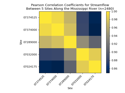
Pearson’s r Correlations Between 5 Stations
The following example shows the correlations between streamflow at 5 stations (07374525, 07374000, 07289000, 07032000, 07024175) along the Mississippi River, listed from downstream to upstream. First we have to fetch the streamflow data for these stations, to do this we will use the dataretrieval package to access the USGS Water Data database.
# get the data from these 5 sites
site_list = ["USGS-07374525", "USGS-07374000", "USGS-07289000", "USGS-07032000", "USGS-07024175"]

# fetch some streamflow data from USGS Water Data as a list of dataframes
df_list = []
for site in site_list:
    df, _ = dataretrieval.waterdata.get_daily(monitoring_location_id=site, time="2012-01-01/2022-12-31",
                                      parameter_code='00060')
    df_list.append(df)
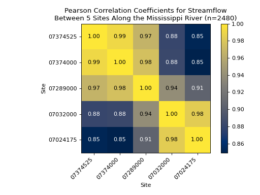
Once we’ve collected the streamflow data, we will calculate the pair-wise correlations between the stations using the hyswap.similarity.calculate_correlations function and then plot the results using hyswap.plots.plot_similarity_heatmap.
# calculate correlations
results, n_obs = hyswap.similarity.calculate_correlations(df_list, "value")

# make plot
ax = hyswap.plots.plot_similarity_heatmap(
    results, n_obs=n_obs,
    cmap='cividis',
    title="Pearson Correlation Coefficients for Streamflow\n" +
          "Between 5 Sites Along the Mississippi River")

# show the plot
plt.tight_layout()
plt.show()

If we’d like, we can display the specific values of the correlations by setting the show_values argument to True in the hyswap.plots.plot_similarity_heatmap function.
# get the data from these 5 sites
site_list = ["USGS-07374525", "USGS-07374000", "USGS-07289000", "USGS-07032000", "USGS-07024175"]

# fetch some streamflow data from USGS Water Data as a list of dataframes
df_list = []
for site in site_list:
    df, _ = dataretrieval.waterdata.get_daily(monitoring_location_id=site, time="2012-01-01/2022-12-31",
                                      parameter_code='00060')
    df_list.append(df)

# calculate correlations
results, n_obs = hyswap.similarity.calculate_correlations(df_list, "value")

# make plot
ax = hyswap.plots.plot_similarity_heatmap(
    results, n_obs=n_obs,
    cmap='cividis',
    title="Pearson Correlation Coefficients for Streamflow\n" +
          "Between 5 Sites Along the Mississippi River",
    show_values=True)

# show the plot
plt.tight_layout()
plt.show()

Wasserstein Distances Between 5 Stations
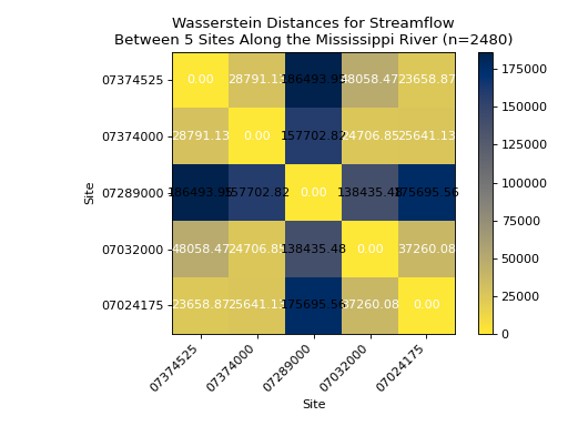
In this example we compare the same 5 time-series as the previous example, but instead of calculating correlations, we calculate the Wasserstein Distance between each pairing of time-series. The Wasserstein Distance is a measure of the distance between two probability distributions, in this case the probability distributions of the streamflow values at each station. Specifically in hyswap, we utilize the scipy.stats.wasserstein_distance() function, and are therefore specifically calculating the “first” Wasserstein Distance between two time-series. Note that we are using the reverse default colormap so that the distance information aligns with the similarity plots above, where more similar = yellow and less similar = blue.
# get the data from these 5 sites
site_list = ["USGS-07374525", "USGS-07374000", "USGS-07289000", "USGS-07032000", "USGS-07024175"]

# fetch some streamflow data from USGS Water Data as a list of dataframes
df_list = []
for site in site_list:
    df, _ = dataretrieval.waterdata.get_daily(monitoring_location_id=site, time="2012-01-01/2022-12-31",
                                      parameter_code='00060')
    df_list.append(df)

# calculate Wasserstein Distances
results, n_obs = hyswap.similarity.calculate_wasserstein_distance(df_list, "value")

# make plot
ax = hyswap.plots.plot_similarity_heatmap(
    results, n_obs=n_obs,
    cmap='cividis_r',
    title="Wasserstein Distances for Streamflow\n" +
          "Between 5 Sites Along the Mississippi River",
    show_values=True)

# show the plot
plt.tight_layout()
plt.show()

Energy Distances Between 5 Stations
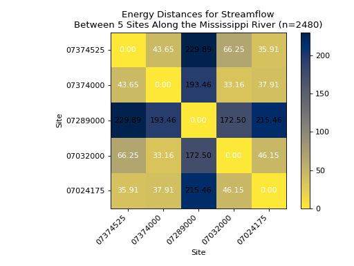
In this example we compare the same 5 time-series as the previous example, but this time using another distance measure, the so-called Energy Distance between two time-series. The energy_dist is a statistical distance between two probability distributions, in this case the probability distributions of the streamflow values at each station. Specifically in hyswap, we utilize the scipy.stats.energy_distance() function. Note that we are using the reverse default colormap so that the distance information aligns with the similarity plots above, where more similar = yellow and less similar = blue.
# get the data from these 5 sites
site_list = ["USGS-07374525", "USGS-07374000", "USGS-07289000", "USGS-07032000", "USGS-07024175"]

# fetch some streamflow data from USGS Water Data as a list of dataframes
df_list = []
for site in site_list:
    df, _ = dataretrieval.waterdata.get_daily(monitoring_location_id=site, time="2012-01-01/2022-12-31",
                                      parameter_code='00060')
    df_list.append(df)

# calculate Wasserstein Distances
results, n_obs = hyswap.similarity.calculate_energy_distance(df_list, "value")

# make plot
ax = hyswap.plots.plot_similarity_heatmap(
    results, n_obs=n_obs,
    cmap='cividis_r',
    title="Energy Distances for Streamflow\n" +
          "Between 5 Sites Along the Mississippi River",
    show_values=True)

# show the plot
plt.tight_layout()
plt.show()
