Cumulative Streamflow Hydrographs
The following examples show how to fetch data and calculate values for a cumulative streamflow hydrograph before plotting the cumulative hydrograph using the hyswap hyswap.plots.plot_cumulative_hydrograph function.
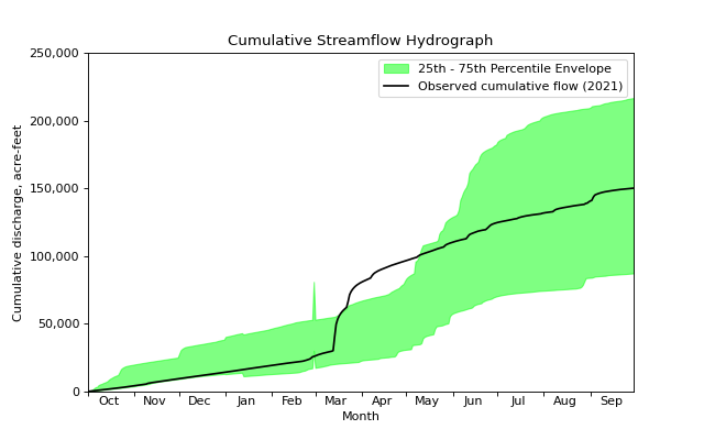
Cumulative Streamflow Over The 2021 Water Year
First we will fetch some streamflow data from the USGS Water Data APIs using the dataretrieval package.
In this example we will fetch 20 years of data from a single site and then use the hyswap.plot.plot_cumulative_hydrograph function to calculate (via hyswap.cumulative.calculate_daily_cumulative_values) and plot cumulative flows.
# get some data from the USGS Water Data APIs
df, md = dataretrieval.waterdata.get_daily(
    monitoring_location_id='USGS-06803495',
    parameter_code='00060',
    time='2001-01-01/2021-12-31')

# plot the cumulative streamflow hydrograph
fig, ax = plt.subplots(figsize=(8, 5))
ax = hyswap.plots.plot_cumulative_hydrograph(
    df,
    data_column_name='value',
    date_column_name='time',
    target_years=2021,
    ax=ax, year_type='water',
    title='Cumulative Streamflow Hydrograph')
plt.show()
Cumulative Streamflow Over The 2021 Calendar Year
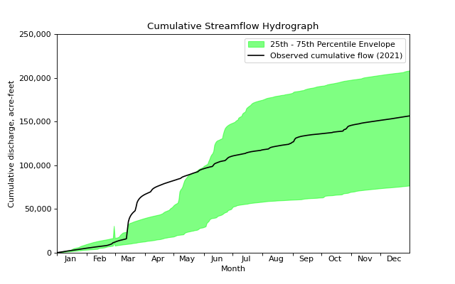
We can also calculate and visualize the cumulative streamflow hydrograph for the 2021 calendar year, rather than the water year.
The code is very similar, we simply do not specify the year_type argument in the hyswap.plot.plot_cumulative_hydrograph function, as the default is to use the calendar year.
# get some data from the USGS Water Data APIs
df, md = dataretrieval.waterdata.get_daily(
    monitoring_location_id='USGS-06803495',
    parameter_code='00060',
    time='2001-01-01/2021-12-31')

# plot the cumulative streamflow hydrograph
fig, ax = plt.subplots(figsize=(8, 5))
ax = hyswap.plots.plot_cumulative_hydrograph(
    df,
    data_column_name='value',
    date_column_name='time',
    target_years=2021,ax=ax,
    title='Cumulative Streamflow Hydrograph')
plt.show()
Cumulative Streamflow Over The 2021 Climate Year
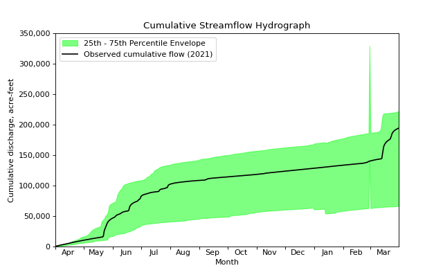
We can also calculate and visualize the cumulative streamflow hydrograph for the 2021 climate year, rather than the water year or the calendar year.
The code is very similar, we simply specify the year_type argument in the hyswap.plot.plot_cumulative_hydrograph function to be ‘climate’.
# get some data from the USGS Water Data APIs
df, md = dataretrieval.waterdata.get_daily(
    monitoring_location_id='USGS-06803495',
    parameter_code='00060',
    time='2001-01-01/2021-12-31')

# plot the cumulative streamflow hydrograph
fig, ax = plt.subplots(figsize=(8, 5))
ax = hyswap.plots.plot_cumulative_hydrograph(
    df,
    data_column_name='value',
    date_column_name='time',
    target_years=2021,
    ax=ax, year_type='climate',
    title='Cumulative Streamflow Hydrograph')
plt.show()
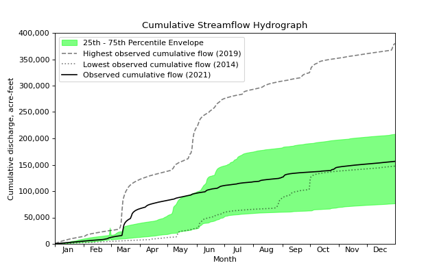
Visualizing the Minimum and Maximum Cumulative Percentile Values
We can also visualize the minimum and maximum cumulative percentile values for a given year as dotted and dashed lines respectively. We will use the calendar year example to showcase this functionality.
# get some data from the USGS Water Data APIs
df, md = dataretrieval.waterdata.get_daily(
    monitoring_location_id='USGS-06803495',
    parameter_code='00060',
    time='2001-01-01/2021-12-31')

# plot the cumulative streamflow hydrograph
fig, ax = plt.subplots(figsize=(8, 5))
ax = hyswap.plots.plot_cumulative_hydrograph(
    df,
    data_column_name='value',
    date_column_name='time',
    target_years=2021,
    ax=ax,
    max_year=True, min_year=True,
    title='Cumulative Streamflow Hydrograph')
plt.show()
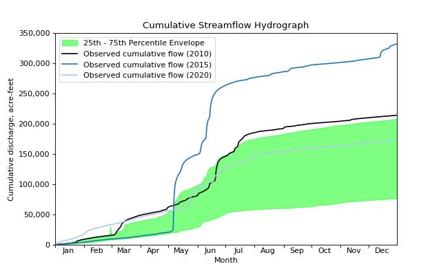
Visualizing Multiple Years of Data
We are not limited to explicitly visualizing the cumulative streamflow from individual years. We can supply multiple target_years as a list, and each will be plotted as an individual cumulative discharge line with an associated label in the legend. Below is an example of this functionality wherein we plot the cumulative discharge for years 2010, 2015, and 2020.
# get some data from the USGS Water Data APIs
df, md = dataretrieval.waterdata.get_daily(
    monitoring_location_id='USGS-06803495',
    parameter_code='00060',
    time='2001-01-01/2021-12-31')

# plot the cumulative streamflow hydrograph
fig, ax = plt.subplots(figsize=(8, 5))
ax = hyswap.plots.plot_cumulative_hydrograph(
    df,
    data_column_name='value',
    date_column_name='time',
    target_years=[2010, 2015, 2020],
    ax=ax, title='Cumulative Streamflow Hydrograph')
plt.show()
Customizing the Filled Envelope
We can customize both the percentile thresholds between which a shaded area is plotted, as well as the color and transparency of the shaded area.
The percentile thresholds used as the upper and lower-bound of the shaded area can be specified using the envelope_pct argument.
The color and transparency, as well as other properties, of the filled region can be customized by passing keyword arguments to the hyswap.plots.plot_cumulative_hydrograph function, as those arguments are passed to the matplotlib.axes.Axes.fill_between() function.
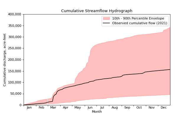
We provide an example of doing this by filling between the 10th and 90th percentiles, and making the filled region red and semi-transparent.
# get some data from the USGS Water Data APIs
df, md = dataretrieval.waterdata.get_daily(
    monitoring_location_id='USGS-06803495',
    parameter_code='00060',
    time='2001-01-01/2021-12-31')

# plot the cumulative streamflow hydrograph
fig, ax = plt.subplots(figsize=(8, 5))
ax = hyswap.plots.plot_cumulative_hydrograph(
    df,
    target_years=2021,
    data_column_name='value',
    date_column_name='time',
    envelope_pct=[10, 90], color='red', alpha=0.25,
    ax=ax, title='Cumulative Streamflow Hydrograph')
plt.show()
