Streamflow Duration Hydrographs
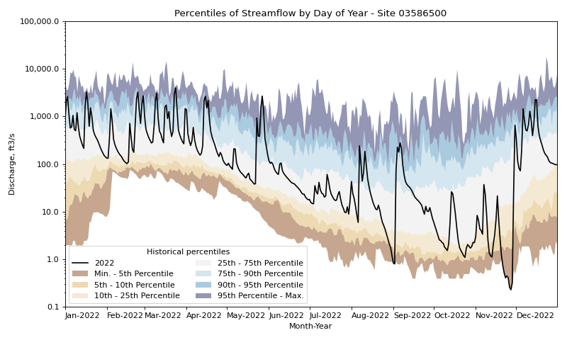
These examples show how a streamflow hydrograph can be constructed by fetching historical streamflow data from a single USGS Water Data gage using dataretrieval, calculating daily percentiles of streamflow for each day of the year for the year 2022, and plotting these data using the hyswap function hyswap.plots.plot_duration_hydrograph.
Calculating Percentiles Using hyswap
First, we will fetch streamflow data for a single gage from USGS Water Data using the dataretrieval package.
df, _ = dataretrieval.waterdata.get_daily(monitoring_location_id="USGS-03586500",
                                  parameter_code="00060",
                                  time="1776-01-01/2022-12-31")
Next we will calculate the percentiles for each day of the year based on historic streamflow data using the hyswap.percentiles.calculate_variable_percentile_thresholds_by_day function.
percentiles_by_day = hyswap.percentiles.calculate_variable_percentile_thresholds_by_day(
    df, data_column_name="value", date_column_name="time"
)
Finally, we will plot the streamflow data for 2022 on top of the historical percentiles.
# get year/doy information for the data
df_year = hyswap.utils.define_year_doy_columns(df,
                                               date_column_name='time',
                                               year_type='water',
                                               clip_leap_day=True)
# plotting percentiles by day with line shade between
fig, ax = plt.subplots(figsize=(10, 6))
# filter down to data from 2022
df_2022 = df_year[df_year.index.year == 2022]
# plot data
ax = hyswap.plots.plot_duration_hydrograph(
    percentiles_by_day,
    df_2022,
    data_column_name="value",
    ax=ax,
    data_label="2022",
    title="Percentiles of Streamflow by Day of Year - Site 03586500"
)
plt.tight_layout()
plt.show()
Fetching Percentiles from the NWIS Statistics Service
You don’t have to compute the percentiles using hyswap.
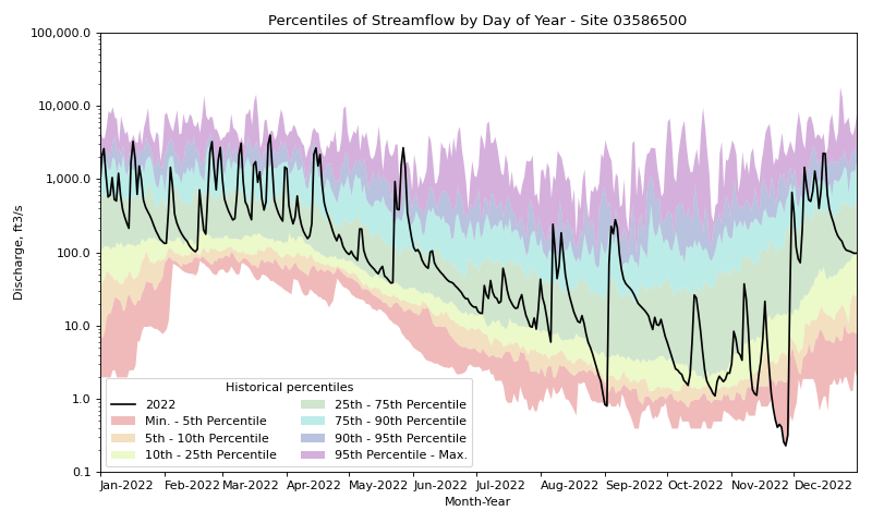
If you’d rather use the NWIS web service daily percentiles, you can use those values instead.
We provide a convenience utility function to help make this possible, hyswap.utils.munge_nwis_stats.
Below is an example of fetching NWIS daily statistics data using the dataretrieval package, and then munging and plotting the data with hyswap.
First, we will use dataretrieval to fetch both the statistics data from NWIS, as well as streamflow data from the year 2022.
df_stats, _ = dataretrieval.nwis.get_stats(
    "03586500",
    parameterCd="00060",
    statReportType="daily"
)

df_flow, _ = dataretrieval.waterdata.get_daily(
    monitoring_location_id="USGS-03586500",
    parameter_code="00060",
    time="2022-01-01/2022-12-31"
)
Now that we’ve retrieved our web data, we will apply some hyswap functions to make a duration hydrograph plot. Let’s also try using the built-in ‘Rainbow’ color palette, which matches the original WaterWatch color scheme, but is not as colorblind-friendly as the default ‘BrownBlue’ palette.
# plotting percentiles by day with line shade between
fig, ax = plt.subplots(figsize=(10, 6))
# munge the statistics data
df_stats = hyswap.utils.munge_nwis_stats(df_stats)
# plot the duration hydrograph
ax = hyswap.plots.plot_duration_hydrograph(
    df_stats,
    df_flow,
    data_column_name="value",
    date_column_name="time",
    ax=ax,
    data_label="2022",
    title="Percentiles of Streamflow by Day of Year - Site 03586500",
    color_palette="Rainbow"
)
plt.tight_layout()
plt.show()
Plotting by Water Year
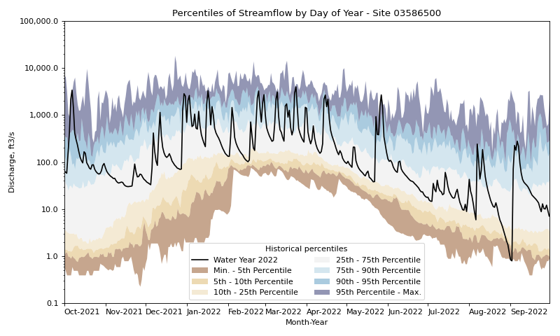
The examples above show how to plot the percentiles by day of year using the calendar year. In this example, we will plot the percentiles by day of water year, as water years are commonly used by hydrologists. The only change this requires from above is specifying the type of year we are planning to use when calculating the daily percentile thresholds.
# fetch historic data from USGS Water Data
df, _ = dataretrieval.waterdata.get_daily(monitoring_location_id="USGS-03586500",
                                  parameter_code="00060",
                                  time="1776-01-01/2022-12-31")

# calculate historic daily percentile thresholds for water years
percentiles_by_day = hyswap.percentiles.calculate_variable_percentile_thresholds_by_day(
    df, data_column_name="value", date_column_name="time"
)

# get year/doy information
df_year = hyswap.utils.define_year_doy_columns(df,
                                               date_column_name='time',
                                               year_type='water',
                                               clip_leap_day=True)

# plotting percentiles by day with line shade between
fig, ax = plt.subplots(figsize=(10, 6))
# filter down to data from 2022
df_2022 = df_year[df_year['index_year'] == 2022]
# plot data
ax = hyswap.plots.plot_duration_hydrograph(
    percentiles_by_day,
    df_2022,
    data_column_name="value",
    ax=ax,
    data_label="Water Year 2022",
    title="Percentiles of Streamflow by Day of Year - Site 03586500"
)
plt.tight_layout()
plt.show()
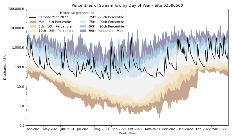
Plotting by Climate Year
In this example, we will plot the percentiles by day of climate year. The only change this requires from above is specifying the type of year we are planning to use when calculating the daily percentile thresholds.
# fetch historic data from USGS Water Data
df, _ = dataretrieval.waterdata.get_daily(monitoring_location_id="USGS-03586500",
                                  parameter_code="00060",
                                  time="1776-01-01/2022-12-31")

# calculate historic daily percentile thresholds for water years
percentiles_by_day = hyswap.percentiles.calculate_variable_percentile_thresholds_by_day(
    df, data_column_name="value", date_column_name="time"
)

# get year/doy information
df_year = hyswap.utils.define_year_doy_columns(df,
                                               date_column_name='time',
                                               year_type='climate',
                                               clip_leap_day=True)

# plotting percentiles by day with line shade between
fig, ax = plt.subplots(figsize=(10, 6))
# filter down to data from 2022
df_2022 = df_year[df_year['index_year'] == 2022]
# plot data
ax = hyswap.plots.plot_duration_hydrograph(
    percentiles_by_day,
    df_2022,
    data_column_name="value",
    ax=ax,
    data_label="Climate Year 2022",
    title="Percentiles of Streamflow by Day of Year - Site 03586500"
)
plt.tight_layout()
plt.show()
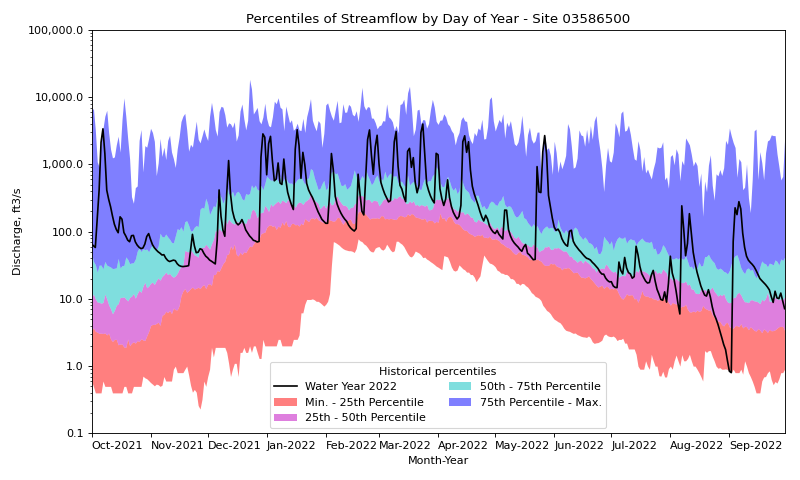
Plotting Custom Set of Percentile Thresholds
In this example we will calculate and plot a unique set of daily percentile thresholds. We will also specify the color palette to be used for the percentile envelopes.
# fetch historic data from USGS Water Data
df, _ = dataretrieval.waterdata.get_daily(monitoring_location_id="USGS-03586500",
                                  parameter_code="00060",
                                  time="1776-01-01/2022-12-31")

# calculate specific historic daily percentile thresholds for water years
percentiles_by_day = hyswap.percentiles.calculate_variable_percentile_thresholds_by_day(
    df, data_column_name="value", date_column_name="time", percentiles=[0, 25, 50, 75, 100]
)

# get year/doy information
df_year = hyswap.utils.define_year_doy_columns(df,
                                               date_column_name='time',
                                               year_type='water',
                                               clip_leap_day=True)

# plotting percentiles by day with line shade between
fig, ax = plt.subplots(figsize=(10, 6))
# filter down to data from 2022
df_2022 = df_year[df_year['index_year'] == 2022]
# plot data
ax = hyswap.plots.plot_duration_hydrograph(
    percentiles_by_day,
    df_2022,
    data_column_name="value",
    pct_list=[0, 25, 50, 75, 100],
    ax=ax,
    data_label="Water Year 2022",
    title="Percentiles of Streamflow by Day of Year - Site 03586500",
    color_palette=['r', 'm', 'c', 'b']
)
plt.tight_layout()
plt.show()
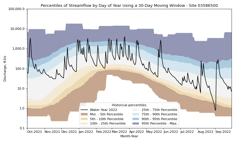
N-day Moving Windows for Historical Daily Percentile Calculations
In this example, we will calculate historical daily percentiles using n-day moving windows that can be compared to daily streamflow in the focal year of interest.
N-day moving windows are specified using the leading_values and trailing_values arguments in calculate_variable_percentile_thresholds_by_day.
We will use a leading value of 15 days and a trailing value of 14 days to show how to use a 30-day moving window to calculate percentiles for each day.
What this means is that the set of historical percentiles calculated for each day are actually calculated using a 30-day window from each year in the dataset.
# fetch historic data from USGS Water Data
df, _ = dataretrieval.waterdata.get_daily(monitoring_location_id="USGS-03586500",
                                    parameter_code="00060",
                                    time="1776-01-01/2022-12-31")

# calculate 30-day moving window historic percentile thresholds for each day in the water year
percentiles_by_day = hyswap.percentiles.calculate_variable_percentile_thresholds_by_day(
    df,
    data_column_name="value",
    date_column_name="time",
    window_width='daily',
    leading_values=15,
    trailing_values=14
)

# get year/doy information
df_year = hyswap.utils.define_year_doy_columns(df,
                                               date_column_name='time',
                                               year_type='water',
                                               clip_leap_day=True)

# plotting percentiles by day with line shade between
fig, ax = plt.subplots(figsize=(10, 6))
# filter down to data from 2022
df_2022 = df_year[df_year['index_year'] == 2022]
# plot data
ax = hyswap.plots.plot_duration_hydrograph(
    percentiles_by_day,
    df_2022,
    data_column_name="value",
    ax=ax,
    data_label="Water Year 2022",
    title="Percentiles of Streamflow by Day of Year Using a 30-Day Moving Window - Site 03586500"
)
plt.tight_layout()
plt.show()
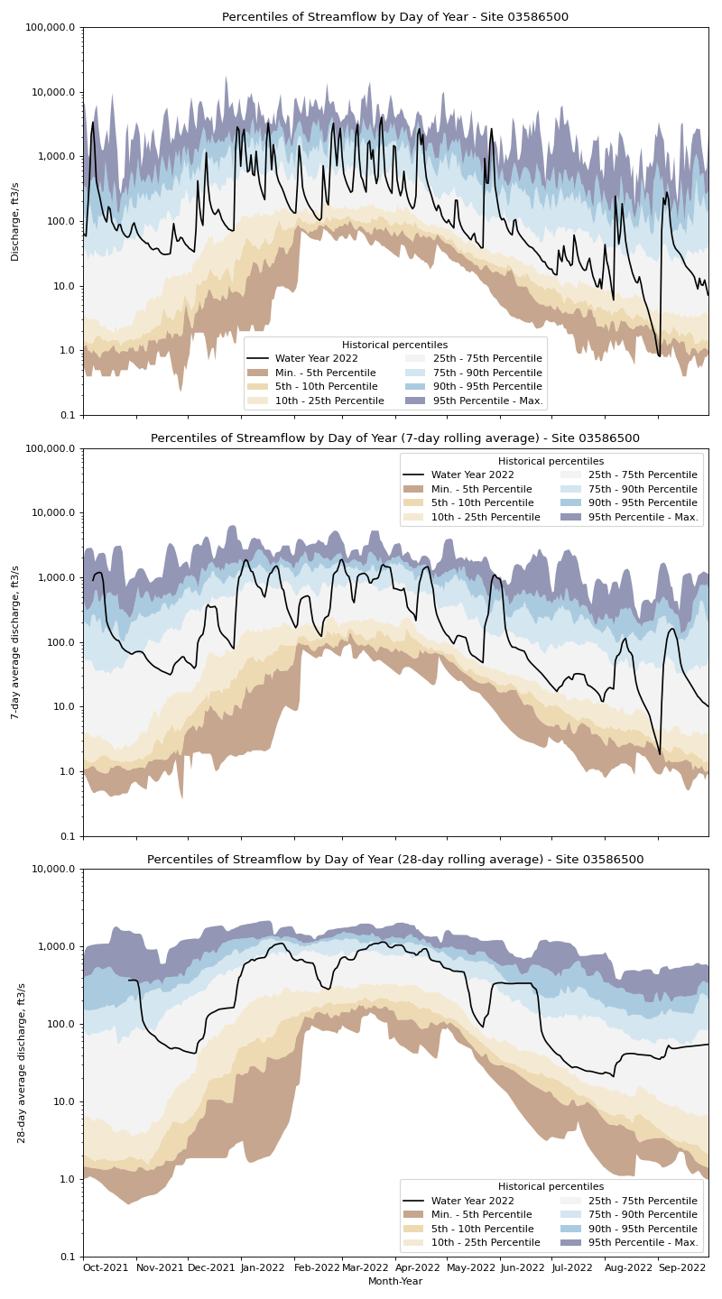
Rolling Averages for Historical Daily Percentile Calculations
In this example, rather than calculating historic daily percentile values based solely on the past values from that day of the year (or moving n-day windows around that day of the year), we will calculate the historic daily percentile values based on rolling averages of the past values around that day.
Under the hood this uses the pandas.DataFrame.rolling() method to calculate the rolling average, with the default parameters.
To show the effect of this, we will plot the historic daily percentile values for the daily (default) rolling average, 7-day rolling average, and the 28-day rolling average.
# fetch historic data from USGS Water Data
df, _ = dataretrieval.waterdata.get_daily(monitoring_location_id="USGS-03586500",
                                    parameter_code="00060",
                                    time="1776-01-01/2022-12-31")

# calculate specific historic daily percentile thresholds for water years
percentiles_by_day = hyswap.percentiles.calculate_variable_percentile_thresholds_by_day(
    df, data_column_name="value", date_column_name="time", window_width='daily'
)
percentiles_by_7day = hyswap.percentiles.calculate_variable_percentile_thresholds_by_day(
    df, data_column_name="value", date_column_name="time", window_width='7-day'
)
percentiles_by_28day = hyswap.percentiles.calculate_variable_percentile_thresholds_by_day(
    df, data_column_name="value", date_column_name="time", window_width='28-day'
)

# get year/doy information
df_year = hyswap.utils.define_year_doy_columns(df,
                                               date_column_name='time',
                                               year_type='water',
                                               clip_leap_day=True)

# plotting percentiles by day with line shade between
fig, ax = plt.subplots(3, 1, figsize=(10, 18), sharex=True)
# filter down to data from 2022
df_2022 = df_year[df_year['index_year'] == 2022]
# plot daily percentiles
hyswap.plots.plot_duration_hydrograph(
    percentiles_by_day,
    df_2022,
    data_column_name="value",
    ax=ax[0],
    data_label="Water Year 2022",
    title="Percentiles of Streamflow by Day of Year - Site 03586500",
    xlab=""
)
# plot 7-day percentiles
hyswap.plots.plot_duration_hydrograph(
    percentiles_by_7day,
    hyswap.utils.rolling_average(df_2022, "value", "7D"),
    data_column_name="value",
    ax=ax[1],
    data_label="Water Year 2022",
    title="Percentiles of Streamflow by Day of Year (7-day rolling average) - Site 03586500",
    xlab="",
    ylab="7-day average discharge, ft3/s"
)
# plot 28-day percentiles
hyswap.plots.plot_duration_hydrograph(
    percentiles_by_28day,
    hyswap.utils.rolling_average(df_2022, "value", "28D"),
    data_column_name="value",
    ax=ax[2],
    data_label="Water Year 2022",
    title="Percentiles of Streamflow by Day of Year (28-day rolling average) - Site 03586500",
    ylab="28-day average discharge, ft3/s"
)
plt.tight_layout()
plt.show()
Customizing Fill Areas
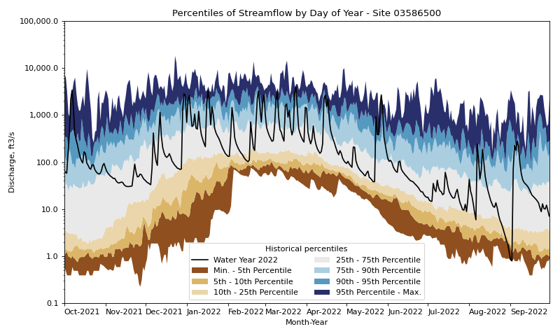
In this example we will customize the fill areas between the percentile thresholds by passing keyword arguments to the hyswap.plots.plot_duration_hydrograph function that are then passed through to the matplotlib.axes.Axes.fill_between() function.
Specifically we will set the alpha argument to 1.0 to make the fill areas opaque (the default value is 0.5 for some transparency).
# fetch historic data from USGS Water Data
df, _ = dataretrieval.waterdata.get_daily(monitoring_location_id="USGS-03586500",
                                  parameter_code="00060",
                                  time="1776-01-01/2022-12-31")

# calculate historic daily percentile thresholds for water years
percentiles_by_day = hyswap.percentiles.calculate_variable_percentile_thresholds_by_day(
    df, data_column_name="value", date_column_name="time"
)

# get year/doy information
df_year = hyswap.utils.define_year_doy_columns(df,
                                               date_column_name='time',
                                               year_type='water',
                                               clip_leap_day=True)

# plotting percentiles by day with line shade between
fig, ax = plt.subplots(figsize=(10, 6))
# filter down to data from 2022
df_2022 = df_year[df_year['index_year'] == 2022]
# plot data
ax = hyswap.plots.plot_duration_hydrograph(
    percentiles_by_day,
    df_2022,
    data_column_name="value",
    ax=ax,
    data_label="Water Year 2022",
    title="Percentiles of Streamflow by Day of Year - Site 03586500",
    alpha=1.0
)
plt.tight_layout()
plt.show()
