Flow Duration Curves
These examples show how flow duration curves can be constructed by fetching data from USGS Water DAta using dataretrieval, analyzing that data using functions provided by hyswap (hyswap.exceedance.calculate_exceedance_probability_from_values_multiple), and then plotted using another hyswap function (hyswap.plots.plot_flow_duration_curve).
For more information on flow duration curves, see the 1959 USGS report by James K. Searcy, titled “Flow-duration curves”.
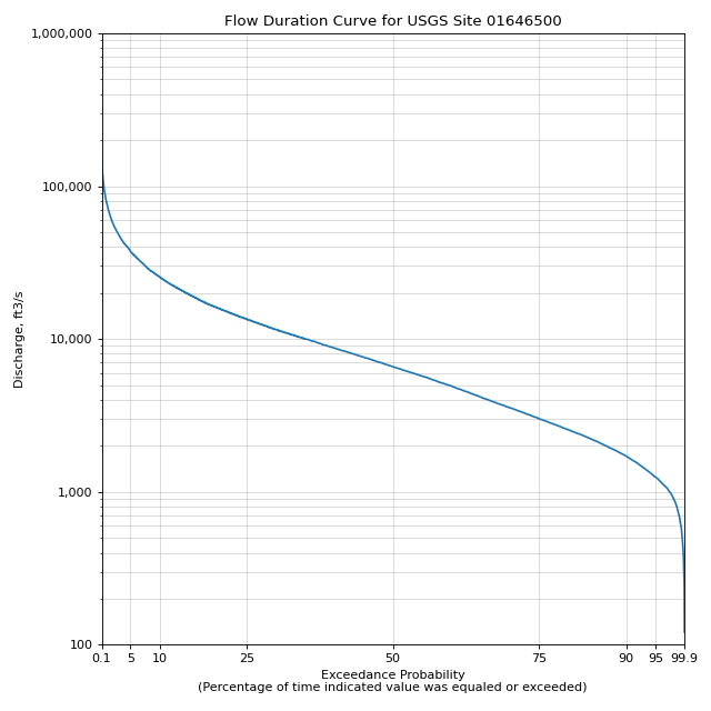
Creating a Flow Duration Curve for Site USGS-01646500
First we will fetch all streamflow data for a single site from USGS Water Data using the dataretrieval package.
# get data from a single site
siteno = 'USGS-01646500'
df, md = dataretrieval.waterdata.get_daily(monitoring_location_id=siteno, parameter_code='00060',
                                   time='1900-01-01/..')
This data can be filtered to only include “approved” data. Data quality is coded as “Approved” and “Provisional”. hyswap has a utility function to help with this.
# filter to only approved data
df = hyswap.utils.filter_approved_data(df, 'approval_status')
Now we can calculate the exceedance probabilities for 10,000 evenly spaced values between the minimum and maximum values in the data.
# generate 10,000 evenly spaced values between the min and max
values = np.linspace(df['value'].min(), df['value'].max(), 10000)

# calculate exceedance probabilities
exceedance_probabilities = hyswap.exceedance.calculate_exceedance_probability_from_values_multiple(
    values, df['value'])
Finally, we can plot the flow duration curve using these exceedance probability values and hyswap.plots.plot_flow_duration_curve, which leverages matplotlib.
# plot
fig, ax = plt.subplots(figsize=(8, 8))
# plot the flow duration curve
ax = hyswap.plots.plot_flow_duration_curve(
    values, exceedance_probabilities, ax=ax,
    title=f'Flow Duration Curve for USGS Site {siteno}')
# show the plot
plt.tight_layout()
plt.show()

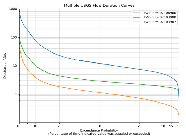
Plotting Multiple Flow Duration Curves on the Same Axes
In this example we will plot multiple flow duration curves on the same axes.
# set up the axes
fig, ax = plt.subplots(figsize=(8, 6))

# create list of sites
sitenos = ["USGS-07108900", "USGS-07103980", "USGS-07103987"]

# loop through sites to get data and plot it
for site in sitenos:
    df, md = dataretrieval.waterdata.get_daily(
        monitoring_location_id=site, parameter_code="00060", time="1776-07-04/..")

    # create 10,000 evenly spaced values min-max
    values = np.linspace(
        df['value'].min(), df['value'].max(), 10000)

    # calculate exceedance probabilities
    exp = hyswap.exceedance.calculate_exceedance_probability_from_values_multiple(
        values, df['value'])

    # plot flow duration curve for this site
    ax = hyswap.plots.plot_flow_duration_curve(
        values, exp, ax=ax, label=f"USGS Site {site}"
    )

# visualize the plot
ax.set_title("Multiple USGS Flow Duration Curves")
ax.set_ylim(0.1, 1000)
ax.legend(loc='best')
plt.tight_layout()
plt.show()

Plotting Observations On Top of the Flow Duration Curve
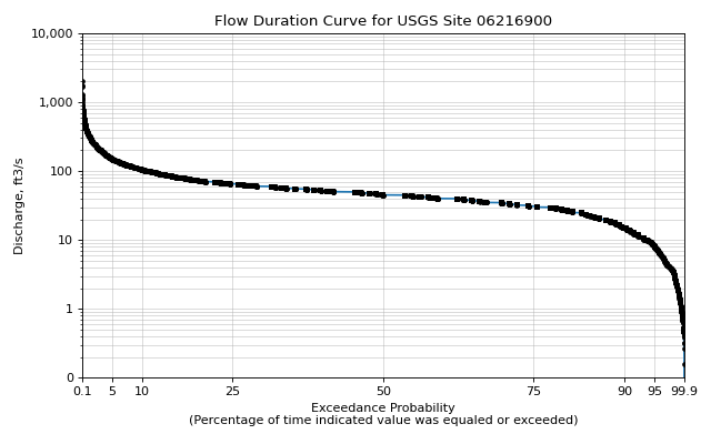
In this example we will plot the flow duration curve with the actual flow observations overlaid on top of the line.
We will do this by utilizing the observations and observation_probability arguments.
To make it obvious which points are observations, we will define them as small black circles by using the scatter_kwargs argument which allows us to pass keyword arguments through to the underlying matplotlib.axes.Axes.scatter() function which is used to plot the observations.
# get data from a single site
siteno = 'USGS-06216900'
df, md = dataretrieval.waterdata.get_daily(monitoring_location_id=siteno, parameter_code='00060',
                                time='1900-01-01/..')
# filter to only approved data
df = hyswap.utils.filter_approved_data(df, 'approval_status')

# generate 10,000 evenly spaced values between the min and max
values = np.linspace(df['value'].min(), df['value'].max(), 10000)

# calculate exceedance probabilities
exceedance_probabilities = hyswap.exceedance.calculate_exceedance_probability_from_values_multiple(
    values, df['value'])

# calculate exceedance probabilities for the observations
obs_probs = hyswap.exceedance.calculate_exceedance_probability_from_values_multiple(
    df['value'], df['value'])

# plot
fig, ax = plt.subplots(figsize=(8, 5))
# plot the flow duration curve
ax = hyswap.plots.plot_flow_duration_curve(
    values, exceedance_probabilities, ax=ax,
    observations=df['value'],
    observation_probabilities=obs_probs,
    scatter_kwargs={'c': 'k', 's': 10, 'zorder': 10},
    title=f'Flow Duration Curve for USGS Site {siteno}')

# show the plot
plt.tight_layout()
plt.show()

Customizing Flow Duration Curve Plots
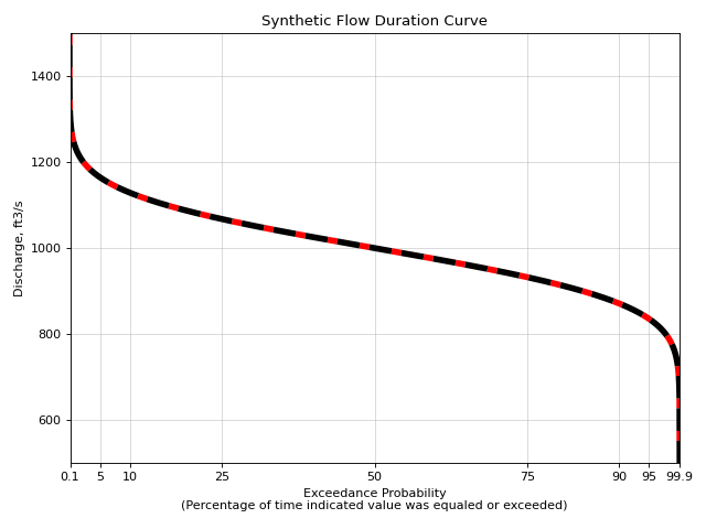
In this example we will generate a synthetic set of exceedance probabilities from a statistical distribution to demonstrate how one can pass **kwargs to the hyswap.plots.plot_flow_duration_curve which are passed through to the underlying matplotlib.axes.Axes.plot() and can be used to customize the line that is plotted.
# set up the axes
fig, ax = plt.subplots(figsize=(8, 6))

# generate synthetic values from a normal distribution with
# a mean of 1,000 and a standard deviation of 100
values = np.linspace(500, 1500, 10000)  # 10,000 evenly spaced values

exp = hyswap.exceedance.calculate_exceedance_probability_from_distribution_multiple(
    values, 'normal', 1000, 100)

# plot synthetic flow duration curve as a black dashed line with a heavier
# line weight than the default and red filled in between the line dashes
ax = hyswap.plots.plot_flow_duration_curve(
    values, exp, ax=ax, title="Synthetic Flow Duration Curve",
    color='k', linestyle='--', linewidth=5, gapcolor='r'
)

# set the y axes to have a linear scale
ax.set_yscale('linear')

# set y axes limits based on the data
ax.set_ylim(values.min(), values.max())

# visualize the plot
plt.tight_layout()
plt.show()
