Raster Hydrographs
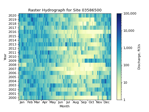
These examples show how raster hydrographs can be constructed by fetching data from USGS Water Data using dataretrieval, formatting that data using functions provided by hyswap (hyswap.rasterhydrograph.format_data), and then plotting using hyswap.plots.plot_raster_hydrograph.
Daily Data Raster Hydrograph Example (Site USGS-03586500)
First we will fetch 20 years of streamflow data for a single site from USGS Water Data using the dataretrieval package.
# get data from a single site
siteno = "USGS-03586500"
df, _ = dataretrieval.waterdata.get_daily(monitoring_location_id=siteno, parameter_code="00060",
                                  time="2000-01-01/2020-12-31")
This data can be formatted using hyswap to prepare it for plotting as a raster hydrograph.
# format the data
df_formatted = hyswap.rasterhydrograph.format_data(df, data_column_name='value', date_column_name='time')
Now the data is arranged with years on the index (rows) and days of the year as columns, this makes it easy to plot as a raster hydrograph with hyswap.plots.plot_raster_hydrograph.
# plot
fig, ax = plt.subplots()
ax = hyswap.plots.plot_raster_hydrograph(
    df_formatted, ax=ax,
    title=f"Raster Hydrograph for Site {siteno}")
plt.show()
7-Day Average Raster Hydrograph Example (Site USGS-03586500)
The same data can be plotted as a 7-day average raster hydrograph by passing the window_width argument to hyswap.rasterhydrograph.format_data function.
# get data from a single site
siteno = "USGS-03586500"
df, _ = dataretrieval.waterdata.get_daily(monitoring_location_id=siteno, parameter_code="00060",
                                  time="2000-01-01/2020-12-31")

# format the data for a 7-day rolling average
df_formatted = hyswap.rasterhydrograph.format_data(
    df, data_column_name='value', date_column_name='time', window_width='7-day')

# plot
fig, ax = plt.subplots()
ax = hyswap.plots.plot_raster_hydrograph(
    df_formatted, ax=ax,
    title=f"7-Day Average Raster Hydrograph for Site {siteno}",
    cbarlab='7-Day Average Streamflow, cubic feet per second')
plt.show()
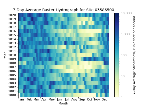
This resulting 7-day averaged raster hydrograph should look “smoother” than the single day raster hydrograph shown previously.
Raster Hydrograph Over a “Water Year”
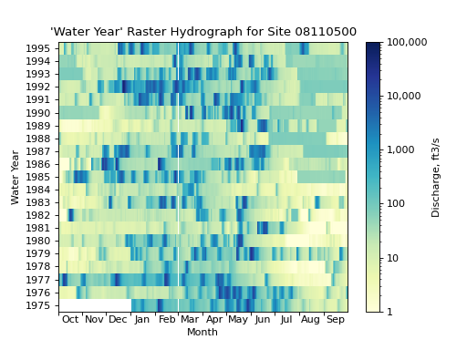
There is also support for visualizing the raster hydrograph over the course of a water year, which begins on October 1st and ends on September 30th of the following year. The ending year is the year that is displayed on the y-axis of the raster hydrograph, for example, the water year 2020 would be displayed as 2020 on the y-axis, but would actually contain data from October 1st, 2019 to September 30th, 2020.
# get data from a single site
siteno = "USGS-08110500"
df, _ = dataretrieval.waterdata.get_daily(monitoring_location_id=siteno, parameter_code="00060",
                                  time="1975-01-01/1995-12-31")

# format the data
df_formatted = hyswap.rasterhydrograph.format_data(
    df, data_column_name='value', date_column_name='time', year_type='water')

# plot
fig, ax = plt.subplots()
ax = hyswap.plots.plot_raster_hydrograph(
    df_formatted, ax=ax,
    title=f"'Water Year' Raster Hydrograph for Site {siteno}",
    xlab='Month', ylab='Water Year')
plt.show()
Raster Hydrograph Over a “Climate Year” with Alt. Colors
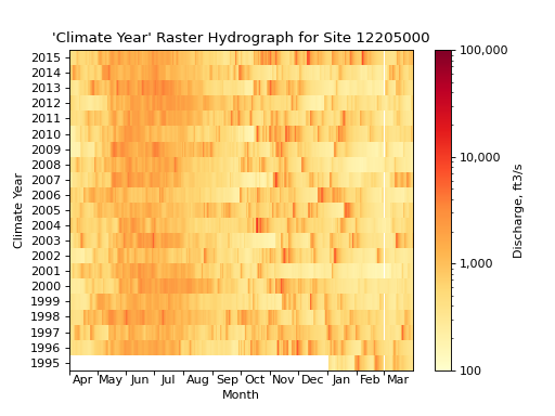
There is also support for visualizing the raster hydrograph over the course of a climate year, which begins on April 1st and ends on March 31th of the following year. The ending year is the year that is displayed on the y-axis of the raster hydrograph, for example, the climate year 2020 would be displayed as 2020 on the y-axis, but would actually contain data from April 1st, 2019 to March 31th, 2020.
In this example, we will also change the color of the raster hydrograph to be shades of yellow, orange, and red, and show how that can be done by passing the cmap keyword argument to hyswap.plots.plot_raster_hydrograph while specifying a matplotlib colormap.
# get data from a single site
siteno = "USGS-12205000"
df, _ = dataretrieval.waterdata.get_daily(monitoring_location_id=siteno, parameter_code="00060",
                                  time="1995-01-01/2015-12-31")

# format the data
df_formatted = hyswap.rasterhydrograph.format_data(
    df, data_column_name='value', date_column_name='time', year_type='climate')

# plot
fig, ax = plt.subplots()
ax = hyswap.plots.plot_raster_hydrograph(
    df_formatted, ax=ax,
    title=f"'Climate Year' Raster Hydrograph for Site {siteno}",
    xlab='Month', ylab='Climate Year',
    cmap='YlOrRd')
plt.show()
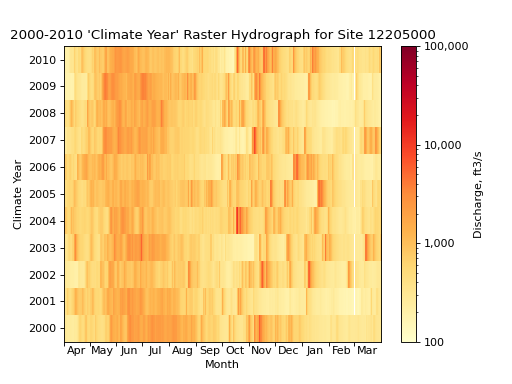
We can also use just a subset of the available data if we wish by specifying start and end years using the begin_year and end_year keyword arguments to hyswap.rasterhydrograph.format_data.
# get data from a single site
siteno = "USGS-12205000"
df, _ = dataretrieval.waterdata.get_daily(monitoring_location_id=siteno, parameter_code="00060",
                                  time="1995-01-01/2015-12-31")

# format the data to years 2000-2010
df_formatted = hyswap.rasterhydrograph.format_data(
    df, data_column_name='value', date_column_name='time', year_type='climate',
    begin_year=2000, end_year=2010)

# plot
fig, ax = plt.subplots()
ax = hyswap.plots.plot_raster_hydrograph(
    df_formatted, ax=ax,
    title=f"2000-2010 'Climate Year' Raster Hydrograph for Site {siteno}",
    xlab='Month', ylab='Climate Year',
    cmap='YlOrRd')
plt.show()
Raster Hydrograph of Non-Streamflow Data
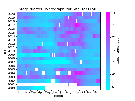
The functions used above to generate raster hydrographs graphically depicting streamflow over time can also be used to visualize other types of data. For example, we can visualize a “raster hydrograph” of the water level at a station over time. We will use station USGS-02311500 in Florida as an example.
# get stage data from a single site
siteno = "USGS-02311500"
parameter_code = "00065"  # code for gage height
df, _ = dataretrieval.waterdata.get_daily(monitoring_location_id=siteno, parameter_code=parameter_code,
                                  time="2000-01-01/2020-12-31")

# format the data
df_formatted = hyswap.rasterhydrograph.format_data(
    df, data_column_name='value', date_column_name='time')

# plot
fig, ax = plt.subplots()
ax = hyswap.plots.plot_raster_hydrograph(
    df_formatted, ax=ax,
    title=f"Stage 'Raster Hydrograph' for Site {siteno}",
    cmap='cool', cbarlab='Gage height, feet')
plt.show()
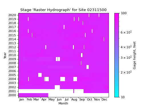
We can improve this visualization by turning off the logarithmic color scale by setting the normalization of the colorbar to be None which overrides the default normalization of matplotlib.colors.LogNorm. The default scheme is logarithmic because this is the most common way to visualize streamflow data, but for other types of data, a linear scale may be more appropriate.
# get stage data from a single site
siteno = "USGS-02311500"
parameter_code = "00065"  # code for gage height
df, _ = dataretrieval.waterdata.get_daily(monitoring_location_id=siteno, parameter_code=parameter_code,
                                  time="2000-01-01/2020-12-31")

# format the data
df_formatted = hyswap.rasterhydrograph.format_data(
    df, data_column_name='value', date_column_name='time')

# plot
fig, ax = plt.subplots()
ax = hyswap.plots.plot_raster_hydrograph(
    df_formatted, ax=ax,
    title=f"Stage 'Raster Hydrograph' for Site {siteno}",
    cmap='cool', cbarlab='Gage height, feet', norm=None)
plt.show()
