06a: Using Matplotlib to Create Animation
This notebooks shows how to create an animation that will run and play inside a notebook. The animation can also be written to a video file.
[1]:
import matplotlib.pyplot as plt
import numpy as np
import matplotlib.animation as animation
from IPython.display import HTML
import cartopy
import cartopy.crs as ccrs
---------------------------------------------------------------------------
ModuleNotFoundError Traceback (most recent call last)
Cell In[1], line 6
2 import numpy as np
3 import matplotlib.animation as animation
4 from IPython.display import HTML
5
----> 6 import cartopy
7 import cartopy.crs as ccrs
ModuleNotFoundError: No module named 'cartopy'
[2]:
def get_y(x, a, b, c, d):
y = a * np.sin(b * x + c) + d
return y
fig, ax = plt.subplots()
x = np.linspace(0, 2 * np.pi, 100)
a = 1
b = 1
c = 0
d = 0
y0 = get_y(x, a, b, c, d)
line = ax.plot(x, y0, 'b-', clip_on=False)
line = line[0]
xd = np.pi
yd = get_y(xd, a, b, c, d)
dot = ax.plot(xd, yd, 'ro', ms=10, clip_on=False)
dot = dot[0]
ax.set_xlim(0, 2 * np.pi)
ax.set_ylim(-a, a)
frames = 50
def update(i):
dt = 2 * np.pi / frames
c = i * dt
# for each frame, update the data stored on each artist.
y = get_y(x, a, b, c, d)
line.set_xdata(x)
line.set_ydata(y)
yd = get_y(xd, a, b, c, d)
dot.set_ydata([yd])
return line,
ani = animation.FuncAnimation(fig=fig, func=update, frames=frames)
plt.close()
HTML(ani.to_jshtml())
[2]:
[3]:
# the following can be used to save the animation to a file
ext = "mp4" # mac mp4
# ext = "avi" # windows avi
ani.save(f"sin_animation.{ext}")
a map example
Plotting data on maps
Creating some data that spans the whole globe.
[4]:
lon, lat = np.mgrid[-180:181, -90:91]
# build a fake dataset that shifts through n time steps
n = 45
data = np.array([2 * np.sin(3 * np.deg2rad(lon+dt)) + 3 * np.cos(4 * np.deg2rad(lat+dt))
for dt in np.arange(0,n)])
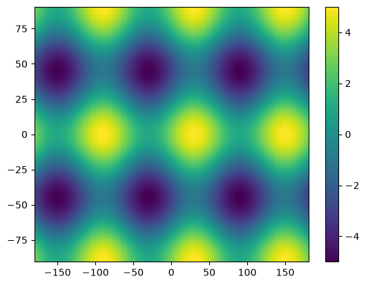
[5]:
# let's check the first time step
plt.pcolormesh(lon, lat, data[0])
plt.colorbar();
Now let’s animate it!
[6]:
fig, ax = plt.subplots()
mesh = ax.pcolormesh(lon, lat, data[0])
fig.colorbar(mesh, orientation='vertical')
def animate(i):
h = data[i]
mesh.set_array(h)
title = ax.set_title(f'Year {i+1}')
return mesh
ani = animation.FuncAnimation(
fig,
animate,
frames=data.shape[0],
# save_count=data.shape[0],
# interval=500,
)
plt.close()
HTML(ani.to_jshtml())
[6]:
Geospatially
Plotting data on a Cartesian grid is equivalent to plotting data in the PlateCarree projection, where meridians and parallels are all straight lines with constant spacing. As a result of this simplicity, global datasets we use often begin in the PlateCarree projection.
We can plot these data values as a contour on a GeoAxes map. To do so, we must specify the transform keyword argument, which specifies the projection type used by our data. The transform keyword can be given to all matplotlib plotting methods. The projection type specified in pcolormesh will be transformed into the projection type specified in the subplot method.
[7]:
fig = plt.figure(figsize=(11, 8.5))
ax = plt.subplot(1, 1, 1, projection=ccrs.Orthographic(central_latitude=45))
ax.coastlines()
mesh = ax.pcolormesh(lon, lat, data[0], transform=ccrs.PlateCarree())
plt.colorbar(mesh, orientation='horizontal', pad=.05);
---------------------------------------------------------------------------
NameError Traceback (most recent call last)
Cell In[7], line 2
1 fig = plt.figure(figsize=(11, 8.5))
----> 2 ax = plt.subplot(1, 1, 1, projection=ccrs.Orthographic(central_latitude=45))
3 ax.coastlines()
4 mesh = ax.pcolormesh(lon, lat, data[0], transform=ccrs.PlateCarree())
5 plt.colorbar(mesh, orientation='horizontal', pad=.05);
NameError: name 'ccrs' is not defined
<Figure size 1100x850 with 0 Axes>
Class Activity
Animate the above GeoAxes in the way we had done with the simpler graph previously.
Bonus: How does it work if you switch over to using contourf instead?
[ ]:
[ ]:
[ ]: