06: matplotlib — 2D and 3D plotting
This IPython Notebook is based on a notebook developed by J.R. Johansson (jrjohansson@gmail.com \(-\) http://jrjohansson.github.io)
The latest version of this jupyter notebook lecture is available at https://github.com/jrjohansson/scientific-python-lectures/blob/master/Lecture-4-Matplotlib.ipynb.
The other notebooks in this lecture series are indexed at https://github.com/jrjohansson/scientific-python-lectures.
[1]:
from IPython.display import clear_output, display

from pathlib import Path

output_path = Path("../data/matplotlib")
output_path.mkdir(exist_ok=True, parents=True)
Introduction
matplotlib is an excellent 2D and 3D graphics library for generating scientific figures. Some of the many advantages of this library include:
Easy to get started
Support for \(\LaTeX\) formatted labels and texts
Great control of every element in a figure, including figure size and DPI.
High-quality output in many formats, including PNG, PDF, SVG, EPS.
GUI for interactively exploring figures and support for headless generation of figure files (useful for batch jobs).
One of the of the key features of matplotlib that that makes matplotlib highly suitable for generating figures for scientific publications is that all aspects of the figure can be controlled programmatically. This is important for reproducibility and convenient when one needs to regenerate the figure with updated data or change its appearance.
Import the matplotlib.pyplot module under the name plt (a better approach to using python packages since the matplotlib.pyplot namespace is explicitly defined):
[2]:
import matplotlib.pyplot as plt
import numpy as np
Find the Errorbar subsampling example in the matplotlib gallery. Copy the code in to the empty code block below and execute the code.
[ ]:
Congratulations you have created your first matplotlib figure. Let’s go further down the matplotlib rabbit hole.
The matplotlib object-oriented API
The main idea with object-oriented programming is to have objects that one can apply functions and actions on, and no object or program states should be global (such as the MATLAB-like API). The real advantage of this approach becomes apparent when more than one figure is created, or when a figure contains more than one subplot.
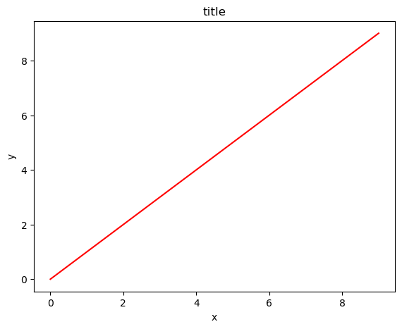
When using the object-oriented API a reference to the newly created figure instance is stored in the fig variable, and from it a new axis instance axes is created using the add_axes method in the Figure class instance fig:
[3]:
fig = plt.figure()

axes = fig.add_axes(
    [0.1, 0.1, 0.8, 0.8]
)  # left, bottom, width, height (range 0 to 1)
x = np.arange(10)
y = np.arange(10)
axes.plot(x, y, "r")

axes.set_xlabel("x")
axes.set_ylabel("y")
axes.set_title("title");
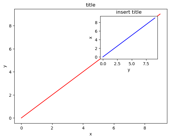
Inset figures
Although a little bit more code is involved, the advantage is that you now have full control of where the plot axes are placed, and you can easily add more than one axis to the figure:
[4]:
fig = plt.figure()

axes1 = fig.add_axes([0.1, 0.1, 0.8, 0.8])  # main axes
axes2 = fig.add_axes([0.55, 0.55, 0.3, 0.3])  # inset axes

# main figure
axes1.plot(x, y, "r")
axes1.set_xlabel("x")
axes1.set_ylabel("y")
axes1.set_title("title")

# insert
axes2.plot(y, x, color="blue")
axes2.set_xlabel("y")
axes2.set_ylabel("x")
axes2.set_title("insert title");
Copy the code in the previous block to the empty code block below. Then we will modify the location of the inset. The coordinates of the plots are in page coordinates (fig.add_axes([lowerleftx, lowerlefty, xlen, ylen])).
[ ]:
[ ]:
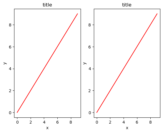
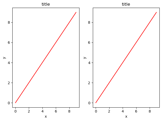
Figures with subplots
[5]:
fig, axes = plt.subplots(nrows=1, ncols=2)

for ax in axes:
    ax.plot(x, y, "r")
    ax.set_xlabel("x")
    ax.set_ylabel("y")
    ax.set_title("title");
Legends, labels and titles
Now that the basics of how to create a figure canvas and add axes instances to the canvas have been covered, methods for decorating a figure with titles, axis labels, and legends will be covered.
Figure titles
A title can be added to each axis instance in a figure. To set the title, use the set_title method in the axes instance:
ax.set_title('title')
Axis labels
Similarly, the labels of the X and Y axes can be set with the methods set_xlabel and set_ylabel:
ax.set_xlabel('x')
ax.set_ylabel('y')
Legends
Legends for curves in a figure can be added in two ways. One method is to use the legend method of the axis object and pass a list/tuple of legend texts for the previously defined curves:
ax.legend(['curve1', 'curve2', 'curve3'])
The method described above follows the MATLAB API. It is somewhat prone to errors and inflexible if curves are added to or removed from the figure (resulting in a wrongly labelled curve).
A better method is to use the label="label text" keyword argument when plots or other objects are added to the figure, and then using the legend method without arguments to add the legend to the figure:
[6]:
fig = plt.figure()
ax = fig.add_axes(
    [0.1, 0.1, 0.8, 0.8]
)  # left, bottom, width, height (range 0 to 1)
ax.plot(x, x**2, label="curve1")
ax.plot(x, x**3, label="curve2")
ax.legend();
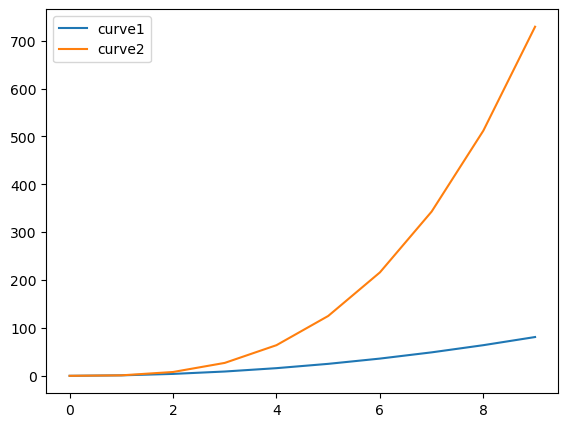
The advantage with this method is that if curves are added or removed from the figure, the legend is automatically updated accordingly.
The legend function takes an optional keyword argument loc that can be used to specify where in the figure the legend is to be drawn. The allowed values of loc are numerical codes for the various places the legend can be drawn. See http://matplotlib.org/users/legend_guide.html#legend-location for details. Some of the most common loc values are:
ax.legend(loc=0) # let `matplotlib` decide the optimal location
ax.legend(loc=1) # upper right corner
ax.legend(loc=2) # upper left corner
ax.legend(loc=3) # lower left corner
ax.legend(loc=4) # lower right corner
Alternatively, location keywords can also be used.
ax.legend(loc='best')
ax.legend(loc='upper right')
ax.legend(loc='upper left')
ax.legend(loc='lower left')
ax.legend(loc='lower right')
Setting colors, linewidths, linetypes
Colors
With matplotlib, the colors of lines and other graphical elements can be defined in a number of ways. First of all, MATLAB-like syntax can be used where 'b' means blue, 'g' means green, etc. The MATLAB API for selecting line styles are also supported: where, for example, ‘b.-’ means a blue line with dots:
[7]:
# MATLAB style line color and style
fig, ax = plt.subplots()
# blue line with dots
ax.plot(x, x**2, "b.-")
# green dashed line
ax.plot(x, x**3, "g--");
Colors can also be defined by their names or RGB hex codes and optionally provide an alpha value using the color and alpha keyword arguments:
[8]:
fig, ax = plt.subplots()

# half-transparant red
ax.plot(x, x + 1, color="red", alpha=0.5)
# RGB hex code for a bluish color
ax.plot(x, x + 2, color="#1155dd")
# RGB hex code for a greenish color
ax.plot(x, x + 3, color="#15cc55");
Line and marker styles
The line width can be changed using the linewidth or lw keyword argument. The line style can be selected using the linestyle or ls keyword arguments:
[9]:
fig, ax = plt.subplots(figsize=(12, 6))

ax.plot(x, x + 1, color="blue", linewidth=0.25)
ax.plot(x, x + 2, color="blue", linewidth=0.50)
ax.plot(x, x + 3, color="blue", linewidth=1.00)
ax.plot(x, x + 4, color="blue", linewidth=2.00)

# possible linestype options ‘-‘, ‘–’, ‘-.’, ‘:’, ‘steps’
ax.plot(x, x + 5, color="red", lw=2, linestyle="-")
ax.plot(x, x + 6, color="red", lw=2, ls="-.")
ax.plot(x, x + 7, color="red", lw=2, ls=":")

# custom dash
(line,) = ax.plot(x, x + 8, color="black", lw=1.50)
line.set_dashes([5, 10, 15, 10])  # format: line length, space length, ...

# possible marker symbols: marker = '+', 'o', '*', 's', ',', '.', '1', '2', '3', '4', ...
ax.plot(x, x + 9, color="green", lw=2, ls="-", marker="+")
ax.plot(x, x + 10, color="green", lw=2, ls="-.", marker="o")
ax.plot(x, x + 11, color="green", lw=2, ls="-", marker="s")
ax.plot(x, x + 12, color="green", lw=2, ls="-", marker="1")

# marker size and color
ax.plot(x, x + 13, color="purple", lw=1, ls="-", marker="o", markersize=2)
ax.plot(x, x + 14, color="purple", lw=1, ls="-", marker="o", markersize=4)
ax.plot(
    x,
    x + 15,
    color="purple",
    lw=1,
    ls="-",
    marker="o",
    markersize=8,
    markerfacecolor="red",
)
ax.plot(
    x,
    x + 16,
    color="purple",
    lw=1,
    ls="-",
    marker="s",
    markersize=8,
    markerfacecolor="yellow",
    markeredgewidth=2,
    markeredgecolor="blue",
);
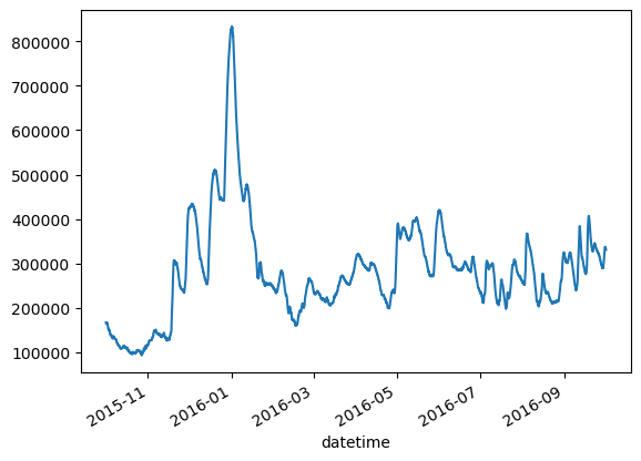
Simple plots of NWIS data
We will use a the USGS dataretrival package to retrieve NWIS data as a pandas dataframe. We will talk more about pandas later
[10]:
import dataretrieval.nwis as nwis
Below we retrieve data for two sites and make a simple matplotlib plot.
[11]:
site = "07010000"

start = "2015-10-01"
end = "2016-09-30"

data = nwis.get_record(
    sites=site,
    service="iv",
    start=start,
    end=end,
)
[12]:
data
[12]:
| 00060 | 00060_cd | site_no | 00065 | 00065_cd | |
|---|---|---|---|---|---|
| datetime | |||||
| 2015-10-01 05:00:00+00:00 | 167000.0 | A | 07010000 | 8.95 | A |
| 2015-10-01 06:00:00+00:00 | 166000.0 | A | 07010000 | 8.94 | A |
| 2015-10-01 07:00:00+00:00 | 166000.0 | A | 07010000 | 8.89 | A |
| 2015-10-01 08:00:00+00:00 | 166000.0 | A | 07010000 | 8.86 | A |
| 2015-10-01 09:00:00+00:00 | 165000.0 | A | 07010000 | 8.79 | A |
| ... | ... | ... | ... | ... | ... |
| 2016-10-01 00:00:00+00:00 | 333000.0 | A | 07010000 | 20.57 | A |
| 2016-10-01 01:00:00+00:00 | 333000.0 | A | 07010000 | 20.56 | A |
| 2016-10-01 02:00:00+00:00 | 333000.0 | A | 07010000 | 20.51 | A |
| 2016-10-01 03:00:00+00:00 | 331000.0 | A | 07010000 | 20.44 | A |
| 2016-10-01 04:00:00+00:00 | 331000.0 | A | 07010000 | 20.42 | A |
8783 rows × 5 columns
[13]:
data["00060"]
[13]:
datetime
2015-10-01 05:00:00+00:00    167000.0
2015-10-01 06:00:00+00:00    166000.0
2015-10-01 07:00:00+00:00    166000.0
2015-10-01 08:00:00+00:00    166000.0
2015-10-01 09:00:00+00:00    165000.0
                               ...
2016-10-01 00:00:00+00:00    333000.0
2016-10-01 01:00:00+00:00    333000.0
2016-10-01 02:00:00+00:00    333000.0
2016-10-01 03:00:00+00:00    331000.0
2016-10-01 04:00:00+00:00    331000.0
Name: 00060, Length: 8783, dtype: float64
[14]:
data["00060"].plot()
[14]:
<Axes: xlabel='datetime'>
[ ]:
[ ]:
[ ]:
[ ]:
More figure customization
Adjusting figure layout
That was easy, but it isn’t so pretty with overlapping figure axes and labels, right?
Overlapping figures can be dealt with using the fig.tight_layout method, which automatically adjusts the positions of the axes on the figure canvas so that there is no overlapping content:
[15]:
fig, axes = plt.subplots(nrows=1, ncols=2)

for ax in axes:
    ax.plot(x, y, "r")
    ax.set_xlabel("x")
    ax.set_ylabel("y")
    ax.set_title("title")

fig.tight_layout();
[ ]:
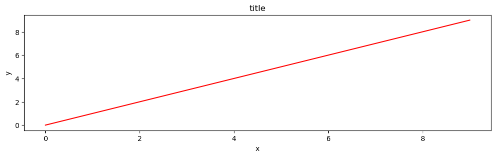
Figure size, aspect ratio and DPI
matplotlib allows the aspect ratio, DPI and figure size to be specified when the Figure object is created, using the figsize and dpi keyword arguments. figsize is a tuple of the width and height of the figure in inches, and dpi is the dots-per-inch (pixel per inch). To create an 800x400 pixel, 100 dots-per-inch figure, we can do:
[16]:
fig, axes = plt.subplots(figsize=(12, 3), dpi=100)

axes.plot(x, y, "r")
axes.set_xlabel("x")
axes.set_ylabel("y")
axes.set_title("title");
Saving figures
To save a figure to a file, the savefig method in the Figure class is used:
[17]:
fig.savefig(output_path / "filename.png")
The DPI can also optionally be specified and different different output formats selected:
[18]:
fig.savefig(output_path / "filename.png", dpi=200)
What formats are available and which ones should be used for best quality?
matplotlib can generate high-quality output in a number formats, including PNG, JPG, EPS, SVG, and PDF. For scientific papers, use PDF whenever possible. (\(\LaTeX\) documents compiled with pdflatex can include PDFs using the includegraphics command \(-\) PDFs can also be edited using Adobe Illustrator and other similar graphics programs).
The figure type (pdf, png, etc.) can be changed simply by changing the file extension.
[19]:
fig.savefig(output_path / "filename.svg")
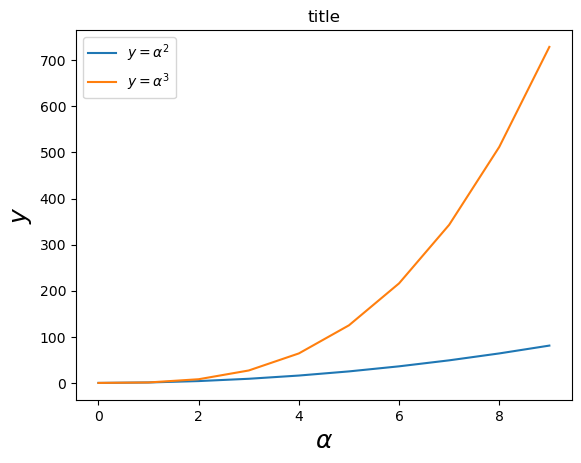
Formatting text: \(\LaTeX\), fontsize, font family
The figure above is functional, but it does not (yet) satisfy the criteria for a figure used in a publication. First and foremost, it may be necessary to use \(\LaTeX\) formatted text, and second, it may be necessary to adjust the font size to appear right in a publication.
matplotlib has great support for \(\LaTeX\). All that is required to incorporate \(\LaTeX\) text is to encapsulate any text (legend, title, label, etc.) in dollar signs. For example, '$y=x^3$'.
But here we can run into a slightly subtle problem with \(\LaTeX\) code and Python text strings. In \(\LaTeX\), the backslash is frequently used in commands, for example \alpha to produce the symbol \(\alpha\). But the backslash already has a meaning in Python strings (the escape code character). To avoid Python messing up our latex code, we need to use “raw” text strings. Raw text strings are prepended with an ‘r’, like r'\alpha' instead of '\alpha':
[20]:
fig, ax = plt.subplots()

ax.plot(x, x**2, label=r"$y = \alpha^2$")
ax.plot(x, x**3, label=r"$y = \alpha^3$")
ax.set_xlabel(r"$\alpha$", fontsize=18)
ax.set_ylabel(r"$y$", fontsize=18)
ax.set_title("title")
ax.legend(loc="upper left");
Control over axis appearance
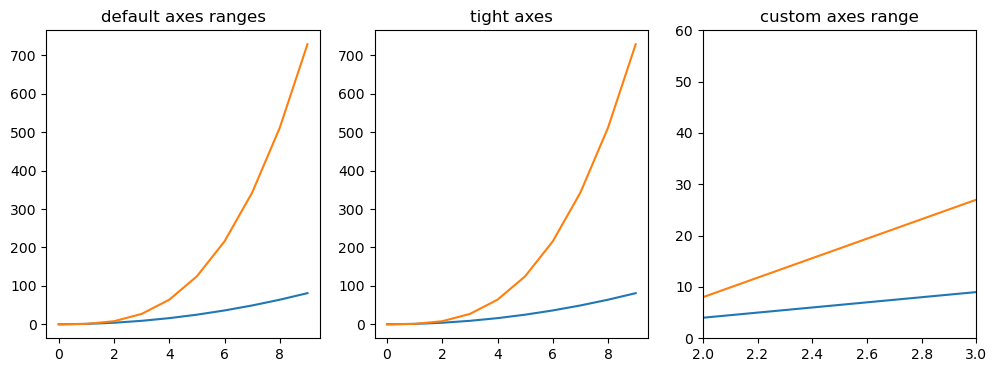
The appearance of the axes is an important aspect of a figure that often must be modified to make publication quality graphics. It also may be necessary to control where the ticks and labels are placed, modify the font size and possibly the labels used on the axes. Methods for controlling axis properties and appearance in a matplotlib figure are explored in this section.
Plot range
Axes ranges can be configured using the set_ylim and set_xlim methods in the axis object, or axis('tight') for automatrically getting “tightly fitted” axes ranges:
[21]:
fig, axes = plt.subplots(1, 3, figsize=(12, 4))

axes[0].plot(x, x**2, x, x**3)
axes[0].set_title("default axes ranges")

axes[1].plot(x, x**2, x, x**3)
axes[1].axis("tight")
axes[1].set_title("tight axes")

axes[2].plot(x, x**2, x, x**3)
axes[2].set_ylim([0, 60])
axes[2].set_xlim([2, 3])
axes[2].set_title("custom axes range");
Logarithmic scale
It is also possible to set a logarithmic scale for one or both axes. This functionality is in fact only one application of a more general transformation system in matplotlib. Each of the axes’ scales are set separately using set_xscale and set_yscale methods which accept one parameter (with the value “log” in this case):
[22]:
fig, axes = plt.subplots(1, 2, figsize=(10, 4))

axes[0].plot(x, x**2, x, np.exp(x))
axes[0].set_title("Normal scale")

axes[1].plot(x, x**2, x, np.exp(x))
axes[1].set_yscale("log")
axes[1].set_title("Logarithmic scale (y)");
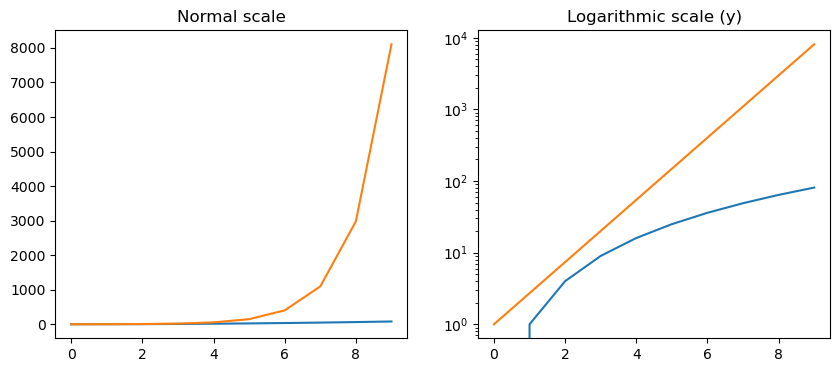
Logarithmic scales can also be specified using semilogx(), semilogy(), or loglog(). What are the differences in the figures plotted using .set_yscale("log") and .semilogy()?
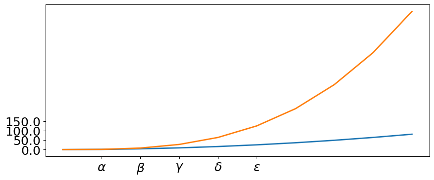
Placement of ticks and custom tick labels
The axis ticks can be explicitly set using with set_xticks and set_yticks, which both take a list of values for where on the axis the ticks are to be placed. The set_xticklabels and set_yticklabels methods can be used to provide a list of custom text labels for each tick location:
[23]:
fig, ax = plt.subplots(figsize=(10, 4))

ax.plot(x, x**2, x, x**3, lw=2)

ax.set_xticks([1, 2, 3, 4, 5])
ax.set_xticklabels(
    [r"$\alpha$", r"$\beta$", r"$\gamma$", r"$\delta$", r"$\epsilon$"],
    fontsize=18,
)

yticks = [0, 50, 100, 150]
ax.set_yticks(yticks)
# use LaTeX formatted labels
ax.set_yticklabels(["$%.1f$" % y for y in yticks], fontsize=18);
There are a number of more advanced methods for controlling major and minor tick placement in matplotlib figures, such as automatic placement according to different policies. See http://matplotlib.org/api/ticker_api.html for details.
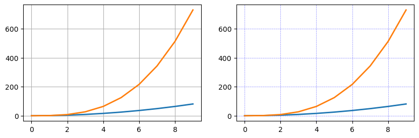
Axis grid
With the grid method in the axis object, grid lines can be turned on and off. The appearance of the grid lines can also be customized using the same keyword arguments as the plot function:
[24]:
fig, axes = plt.subplots(1, 2, figsize=(10, 3))

# default grid appearance
axes[0].plot(x, x**2, x, x**3, lw=2)
axes[0].grid(True)

# custom grid appearance
axes[1].plot(x, x**2, x, x**3, lw=2)
axes[1].grid(color="b", alpha=0.5, linestyle="dashed", linewidth=0.5);
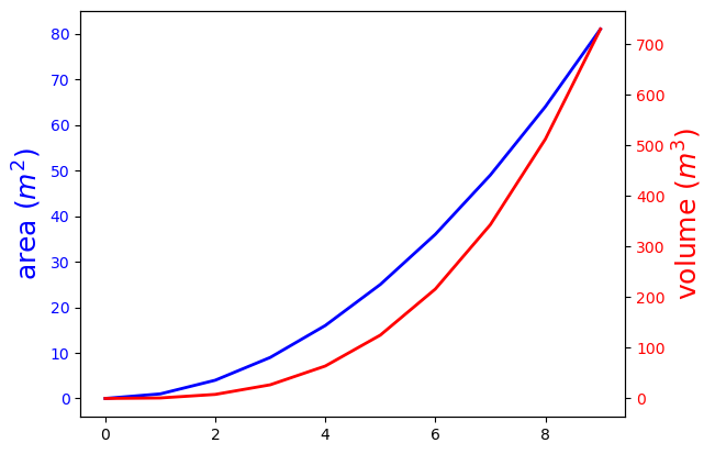
Twin axes
Sometimes it is useful to have dual x or y axes in a figure; for example, when plotting curves with different units together. matplotlib supports this with the twinx and twiny functions:
[25]:
fig, ax1 = plt.subplots()

ax1.plot(x, x**2, lw=2, color="blue")
ax1.set_ylabel(r"area $(m^2)$", fontsize=18, color="blue")
for label in ax1.get_yticklabels():
    label.set_color("blue")

ax2 = ax1.twinx()
ax2.plot(x, x**3, lw=2, color="red")
ax2.set_ylabel(r"volume $(m^3)$", fontsize=18, color="red")
for label in ax2.get_yticklabels():
    label.set_color("red");
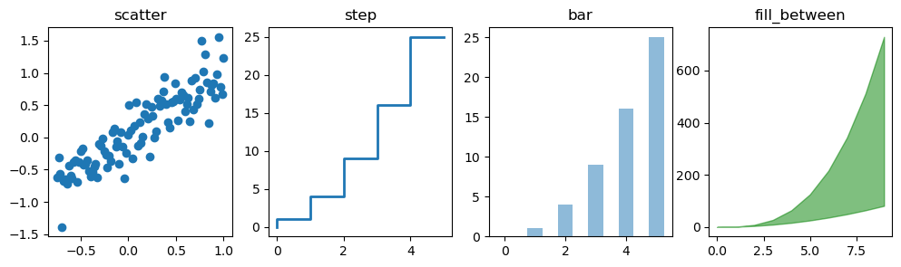
Other 2D plot styles
In addition to the regular plot method, there are a number of other functions for generating different kind of plots. See the matplotlib plot gallery for a complete list of available plot types: http://matplotlib.org/gallery.html. Some of the more useful ones are show below:
[26]:
xx = np.linspace(-0.75, 1.0, 100)
n = np.array([0, 1, 2, 3, 4, 5])

fig, axes = plt.subplots(1, 4, figsize=(12, 3))

axes[0].scatter(xx, xx + 0.25 * np.random.randn(len(xx)))
axes[0].set_title("scatter")

axes[1].step(n, n**2, lw=2)
axes[1].set_title("step")

axes[2].bar(n, n**2, align="center", width=0.5, alpha=0.5)
axes[2].set_title("bar")

axes[3].fill_between(x, x**2, x**3, color="green", alpha=0.5)
axes[3].set_title("fill_between");
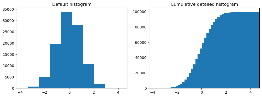
Histograms
[27]:
# A histogram
n = np.random.randn(100000)
fig, axes = plt.subplots(1, 2, figsize=(12, 4))

axes[0].hist(n)
axes[0].set_title("Default histogram")
axes[0].set_xlim((min(n), max(n)))

axes[1].hist(n, cumulative=True, bins=50)
axes[1].set_title("Cumulative detailed histogram")
axes[1].set_xlim((min(n), max(n)));
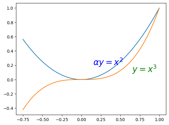
Text annotation
Annotating text in matplotlib figures can be done using the text function. It supports LaTeX formatting just like axis label texts and titles:
[28]:
fig, ax = plt.subplots()

ax.plot(xx, xx**2, xx, xx**3)

ax.text(0.15, 0.2, r"$\alpha y=x^2$", fontsize=20, color="blue")
ax.text(0.65, 0.1, r"$y=x^3$", fontsize=20, color="green");
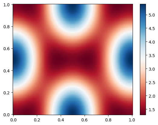
Colormap and contour figures
Colormaps and contour figures are useful for plotting functions of two variables. A colormap will be used to encode one dimension of the data in most of these functions. There are a number of predefined colormaps. It is relatively straightforward to define custom colormaps. For a list of pre-defined colormaps, see: http://www.scipy.org/Cookbook/matplotlib/Show_colormaps
[29]:
alpha = 0.7
phi_ext = 2 * np.pi * 0.5


def flux_qubit_potential(phi_m, phi_p):
    return (
        2
        + alpha
        - 2 * np.cos(phi_p) * np.cos(phi_m)
        - alpha * np.cos(phi_ext - 2 * phi_p)
    )
[30]:
phi_m = np.linspace(0, 2 * np.pi, 100)
phi_p = np.linspace(0, 2 * np.pi, 100)
X, Y = np.meshgrid(phi_p, phi_m)
Z = flux_qubit_potential(X, Y).T
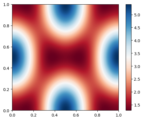
pcolor
[31]:
fig, ax = plt.subplots()

p = ax.pcolor(
    X / (2 * np.pi),
    Y / (2 * np.pi),
    Z,
    cmap=plt.cm.RdBu,
    vmin=abs(Z).min(),
    vmax=abs(Z).max(),
)
cb = fig.colorbar(p, ax=ax)
imshow
[32]:
fig, ax = plt.subplots()

im = plt.imshow(
    Z,
    cmap=plt.cm.RdBu,
    vmin=abs(Z).min(),
    vmax=abs(Z).max(),
    extent=[0, 1, 0, 1],
)
im.set_interpolation("bilinear")

cb = fig.colorbar(im, ax=ax)
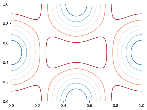
contour
[33]:
fig, ax = plt.subplots()

cnt = plt.contour(
    Z,
    cmap=plt.cm.RdBu,
    vmin=abs(Z).min(),
    vmax=abs(Z).max(),
    extent=[0, 1, 0, 1],
)
Miscellaneous topics
Using FloPy styles to make figures for USGS publications
FloPy’s plotting routines can be used with built in styles from the styles module. The styles module takes advantage of matplotlib’s temporary styling routines by reading in pre-built style sheets. Two different types of styles have been built for flopy: USGSMap() and USGSPlot() styles which can be used to create report quality figures. The styles module also contains a number of methods that can be used for adding axis labels, text, annotations, headings, removing tick lines,
and updating the current font.
Addition information on use of flopy styles can be found in https://github.com/modflowpy/flopy/blob/develop/examples/Notebooks/flopy3.3_PlotMapView.ipynb and https://github.com/modflowpy/flopy/blob/develop/examples/Notebooks/flopy3.3_PlotCrossSection.ipynb
[34]:
%matplotlib inline
from flopy.plot import styles
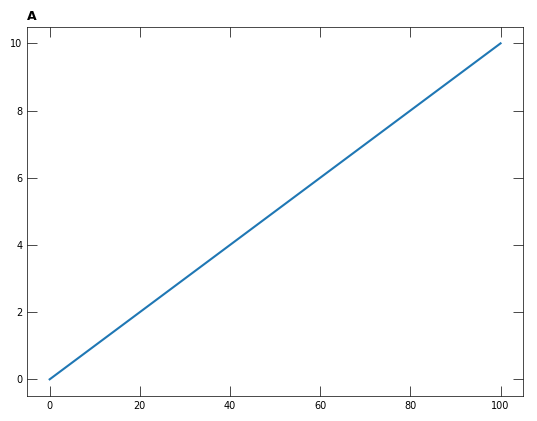
Make a timeseries
[35]:
# styles.set_font_type("sans-serif", "Courier New")
with styles.USGSPlot():
    fig, ax = plt.subplots()
    ax.plot([0, 100], [0, 10])
    styles.heading(ax=ax, idx=0)
Change the font used in the timeseries plot above. The fonts available to matplotlib can be found using
import matplotlib.font_manager
matplotlib.font_manager.findSystemFonts(fontpaths=None, fontext='ttf')
A possible option is family sans-serif fontname Arial Narrow.
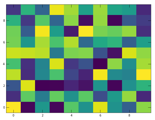
Make a map
[36]:
x = np.random.random((10,10))
X, Y = np.meshgrid(np.arange(0, 10, 1), np.arange(0, 10, 1))
with styles.USGSMap():
    plt.pcolormesh(X, Y, x)
Creating animations with matplotlib
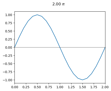
We will animate the sine function over the range of 0 to 2\(\pi\). The first step is to make a numpy array from 0 to 2 using arange to define the variable x. Start with a interval of x on the order of 0.1.
[37]:
x = np.arange(0.0, 2.1, 0.1)
x.shape, x
[37]:
((21,),
 array([0. , 0.1, 0.2, 0.3, 0.4, 0.5, 0.6, 0.7, 0.8, 0.9, 1. , 1.1, 1.2,
        1.3, 1.4, 1.5, 1.6, 1.7, 1.8, 1.9, 2. ]))
[38]:
fig, ax = plt.subplots(nrows=1, ncols=1)
fig.set_figheight(4)
fig.set_figwidth(5)

for idx in range(x.shape[0]):

    ax.cla()

    ax.set_xlim(0, 2)
    ax.set_ylim(-1.1, 1.1)

    i1 = idx + 1
    y = np.sin(x[:i1] * np.pi)
    line = ax.plot(x[:i1], y)
    ax.axhline(y=0, lw=0.5, color="black")
    title_text = fig.suptitle(f"{x[idx]:>2.2f} $\pi$")

    display(fig)
    clear_output(wait=True)
    plt.pause(0.1)
Modify the animation to show the sine function for the full range of 0 to 2\(\pi\) but show the time as a point on the curve that moves in time.
[ ]:
Using PdfPages to create multi-page PDFs
Use your sine function plot to create a pdf for each time. A PdfPages example can be found in the matplotlib gallery at https://matplotlib.org/stable/gallery/misc/multipage_pdf.html
[39]:
from matplotlib.backends.backend_pdf import PdfPages
[40]:
path = Path(f"{output_path}/multipage_pdf.pdf")
y = np.sin(x * np.pi)

with PdfPages(path) as pdf:
    for idx, (xx, yy) in enumerate(zip(x, y)):
        fig, ax = plt.subplots(nrows=1, ncols=1)
        fig.set_figheight(4)
        fig.set_figwidth(5)

        ax.set_xlim(0, 2)
        ax.set_ylim(-1.1, 1.1)

        ax.plot(x, y)
        ax.plot(
            xx, yy, lw=0, marker="o", ms=4, mfc="red", mec="red", clip_on=False
        )

        ax.set_title(r"Page {} - {:6.2f} $\pi$".format(idx + 1, xx))
        pdf.savefig()  # saves the current figure into a pdf page
        plt.close()